Prices
To achieve a professional finish, your artwork must be configured correctly before it reaches our presses. Follow this technical guide to ensure your images and text remain sharp and colour-accurate.
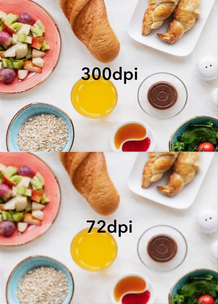
The quality of your final print is directly determined by the resolution of the images within your file.
Standard Resolution: We recommend a standard of 300 dpi (dots per inch).
Low Quality Warning: Using images at 72–96 dpi (which are standard for websites) will result in pixelated and blurry prints.
Pro Tip: Always ensure your images are at the correct size and resolution before placing them into your design.
Printing uses a four-colour process that differs significantly from how colours are displayed on a screen.
CMYK (Cyan, Magenta, Yellow, Key/Black): This is the required colour mode for printing. Tiny dots of these four inks combine to create your images.
RGB (Red, Green, Blue): This mode is for screen use only.
Colour Shifts: We strongly suggest using CMYK mode from the start. Any RGB images submitted will be converted to CMYK automatically, which may result in a noticeable colour shift.
To keep your text legible and prevent "missing font" errors, please adhere to these typography standards.
Minimum Font Size: We recommend a minimum font size of 5pt. However fonts vary so much so we strongly recommend that you print off your design to ensure your text is readable and not too small.
Small Text Sharpness: For very small text (between 5pt and 7pt), set the colour to 100% black to ensure it remains sharp and readable.
Outlining and Embedding: To ensure your text looks exactly as intended, you must either embed all fonts when exporting your PDF or convert them to paths/outlines.
Type 3 fonts: We do not accept Type 3 fonts - these can cause unexpected issues during the printing process. If you have used any Type 3 fonts in your artwork they must be either flattened, or converted into outlines.
Need more help? Explore our additional support guides for expert advice on artwork setup, print file preparation, bleed and crop marks, colour setup, large format artwork and troubleshooting common print file issues.
Our support guides also cover paper stock selection, premium print finishes including spot UV and Scodix, preparing print-ready artwork and understanding the best setup for a wide range of printed products.
Before ordering, you can also use our artwork technical check tool to identify common artwork problems, including low resolution images, missing bleed, incorrect dimensions and RGB colour profiles.
You can also browse our full range of print products, including banners, business cards, flyers, posters and large format printing solutions.