Prices
Business cards may be small, but they have a lot of work to do. In one quick exchange, they need to show who you are, what you do and how someone can contact you. They also need to feel right for your brand.
That means a good business card design is not just about choosing a nice colour or adding a logo. It needs the right size, clear information, balanced spacing, readable text and artwork that is properly set up for print.
Whether you’re creating cards for a new business, refreshing your branding or getting ready for an event, this guide explains how to design a business card that looks professional, feels considered and works in real life.
Yes, business cards are still a useful marketing tool, even in a digital world.
They’re quick to hand out, easy to keep and simple to use in places where a digital exchange can feel awkward or forgettable. They’re especially useful at trade shows, meetings, networking events, local markets, consultations and customer appointments.
A business card can also do more than share contact details. It can be used as a packaging insert, appointment reminder, loyalty card, referral card or mini introduction to your brand. Add a QR code and it can link directly to your website, booking page, online shop, portfolio or social media profile.
The key is to design it with a purpose. Before you start, ask yourself what you want the person to do next. Call you? Visit your site? Book an appointment? Follow you online? Scan a code? That answer should shape the whole design.
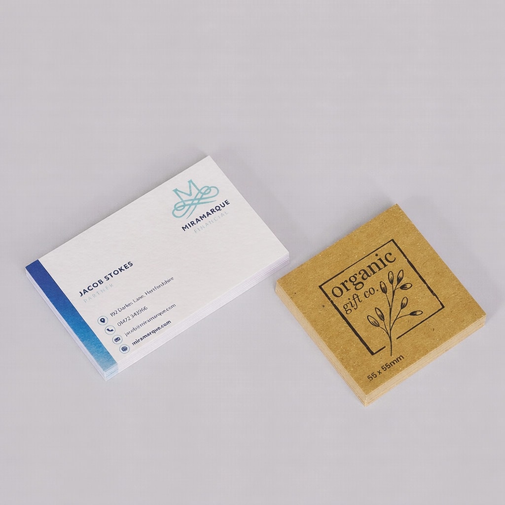
A standard UK business card is 85 x 55mm. This size is popular because it’s compact, practical and fits easily into wallets, card holders and packaging.
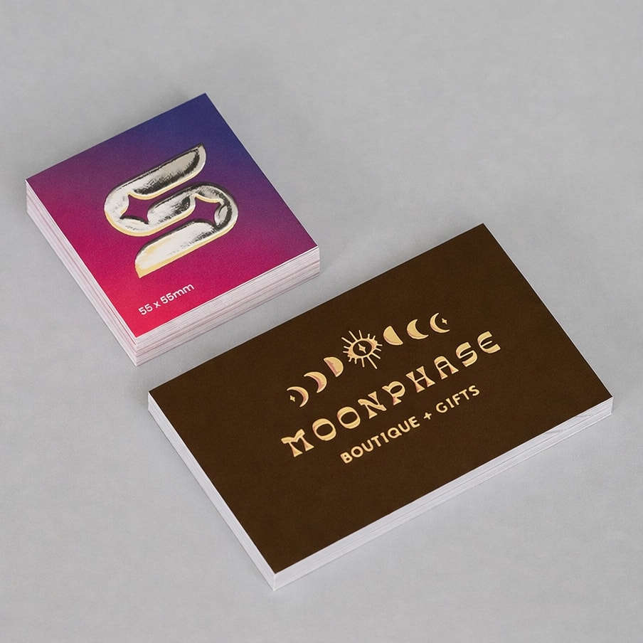
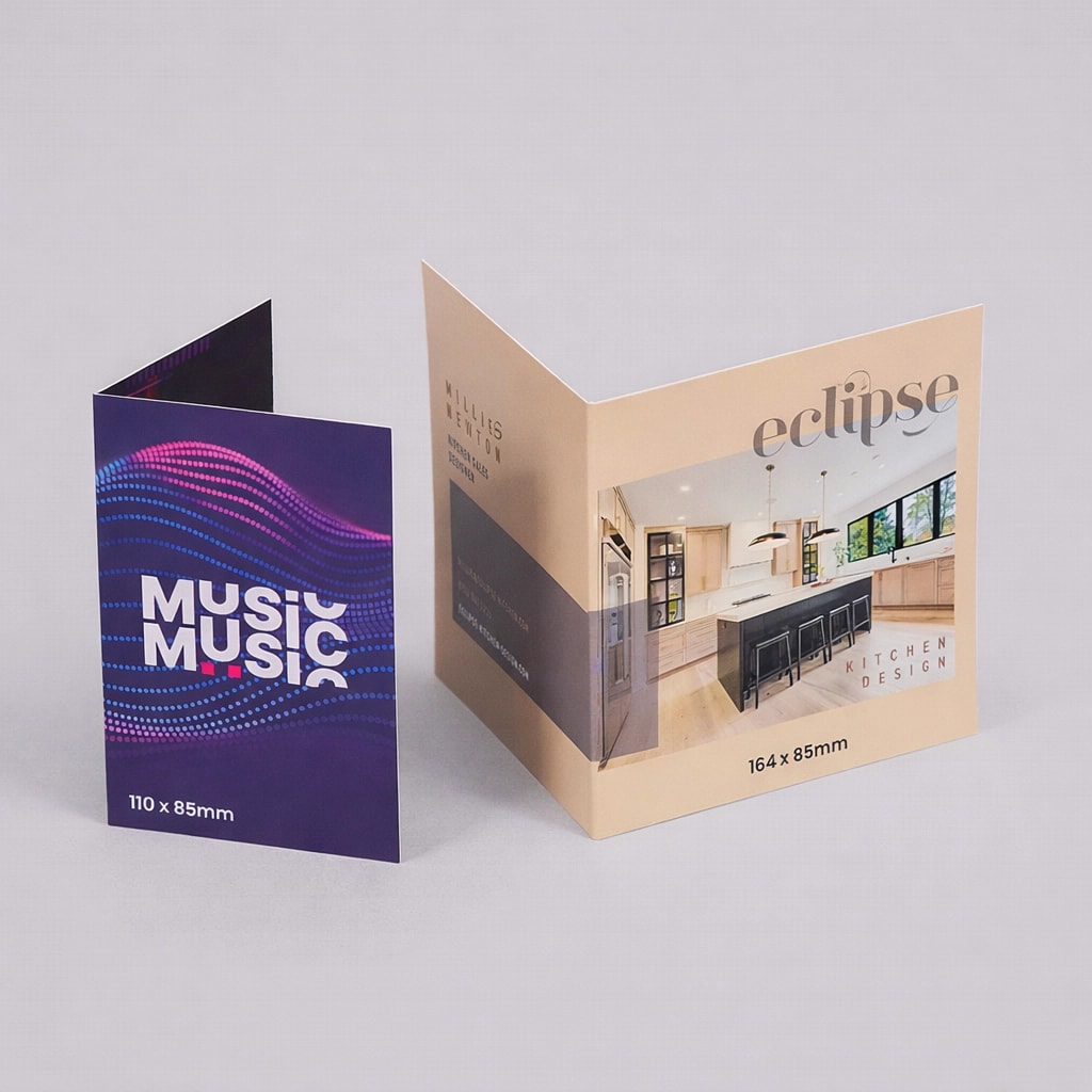
It is not the only option, though. A square 55 x 55mm business card can feel more modern and distinctive, while folded business cards give you extra space for more information. That can be useful for appointment details, loyalty stamps, service lists, care instructions or a short product menu.
You can also choose different styles and finishes depending on how the card will be used. For example, a simple everyday card may be ideal for regular networking, while a thicker or foiled card can be useful when you want to create a more premium first impression.
A business card should give people the information they need without making them work for it. Start with the essentials, then only add extra details if they genuinely help.
Most business cards should include:
Depending on your business, you may also want to include:
The mistake many people make is trying to include everything. A business card is not a flyer. If the layout is too busy, the important information gets harder to find. Keep the main contact details clear and use the back of the card if you need more space.
Before you start designing, decide what needs to be seen first. This is your visual hierarchy.
For most business cards, the logo or business name should be the first thing people notice. After that, the name, role and contact details should be easy to scan. If you’re using a QR code, give it enough space so it doesn’t compete with the rest of the information.
A simple structure could be:
Front of card Logo, business name, tagline or visual brand detail
Back of card Name, job title, contact details, website and QR code
This approach keeps the front clean and gives the back a clear job. It also makes the card feel more considered because each side has a purpose.
Try not to place important text too close to the edge. Business cards are trimmed after printing, so text, logos and QR codes need breathing room. Thin borders close to the edge can also be tricky, as even small trim movement can make them look uneven.
Your business card colours should match your brand and still be easy to read.
Strong colour can help your card stand out, but contrast matters. Pale text on a pale background or dark text on a busy image can make the card difficult to use. If someone has to squint to find your phone number or website, the design is not doing its job.
Think about how the colour will work in print too. Colours can look different on screen compared with paper, especially if you’re designing in a tool like Canva. The paper stock and finish can also change the final appearance. Gloss can make colours feel brighter and more reflective, while uncoated papers can create a softer, more natural finish.
A good rule is to use colour to guide attention. Highlight the logo, brand shape, QR code or key detail, but keep the contact information clear and readable.
A business card needs to be readable at a small size, so font choice is important.
Use a clear typeface for the main information. Decorative fonts can work for a logo, headline or brand accent, but they are usually harder to read when used for phone numbers, email addresses or websites.
Try to avoid using too many fonts on one card. One or two is usually enough. You can create contrast through size, weight and spacing instead of adding more type styles.
Pay close attention to email addresses, web addresses and phone numbers. These details are functional, so clarity matters more than creativity. If the font makes a number, letter or symbol hard to recognise, choose something simpler.
A QR code can be a useful addition, but only if it has a clear purpose.
It can link to a booking page, menu, digital portfolio, online shop, review page, video, contact form or social profile. This is useful when you want the card to do more than hold basic contact details.
However, a QR code should not replace essential information completely. Not everyone will scan it straight away, so it is still worth including your website, email or phone number where possible.
Before printing, always test the QR code from the final artwork. Make sure it scans at the printed size and links to the right page. If the code is too small, too close to other design elements or placed on a low contrast background, it may not work reliably.
Canva is a useful tool for creating business cards, especially if you want a quick design route or a template to work from. To make things easier, WTTB’s Canva business card templates are already set up to the right dimensions, so you can start with the correct size rather than building your file from scratch.
You’ll still need to check the details before ordering. Make sure your design includes bleed, keeps important text and logos away from the trim edge and uses high quality images. If your design has background colours, images or patterns, these should extend into the bleed area so there are no unwanted white edges after trimming.
When you’re ready to export, use a PDF Print file with crop marks and bleed enabled, choosing CMYK colour settings and checking any QR codes are tested at the final printed size.
If you’re unsure how to set this up, WTTB’s Canva Hub includes practical guidance for preparing Canva designs for professional print, along with ready made templates to help you create business cards that are correctly sized from the start.
Designing for print is different from designing for a screen. Your file needs to include the right setup so it can be printed and trimmed cleanly.
Before uploading your business card artwork, check the following:
Bleed is especially important if your design has colour, pattern or imagery running to the edge. It gives the printer a little extra artwork beyond the finished size, helping to avoid unwanted white edges once the card is trimmed.
You should also think about finishes during artwork setup. Spot UV, foil and cut to shape print may need extra setup steps, such as separate artwork layers or specific spot colours. Our Support Guides include practical artwork guidance for print ready files, including setup advice for bleed, crop marks, colour settings and specialist finishes.
The paper stock affects how your business card looks, feels and performs.
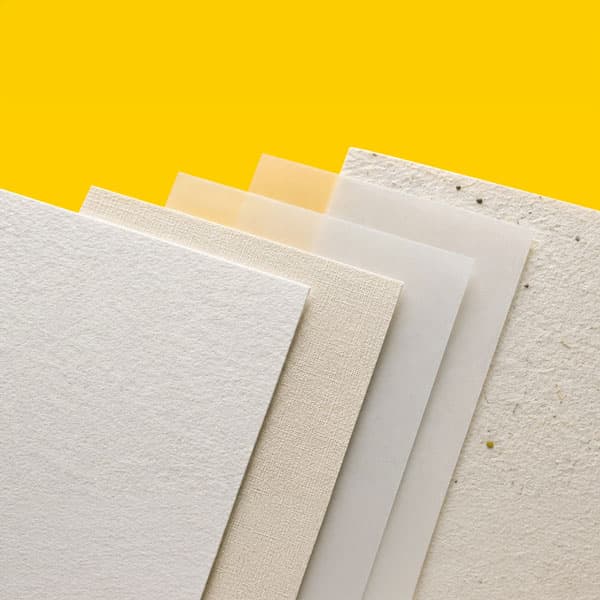
Silk stocks are a popular choice for professional business cards because they offer a smooth finish and strong colour reproduction. Gloss can work well for bold designs and image led cards, as it gives a brighter, more reflective appearance. Uncoated stocks create a softer, more natural feel and can suit brands that want a more understated or tactile finish.
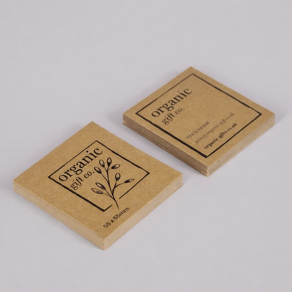
Recycled business cards can be a good choice for brands that want a more considered material option. Kraft business cards have a warm, natural look that suits makers, independent brands, food businesses and creative companies. Premium papers and thicker cards can help create a more luxurious feel when the card needs to make a stronger impression.
If you’re unsure which paper is right for your design, our Print Materials Hub includes more detail on different paper types, finishes and materials, helping you compare the options before choosing your business cards.
The best finish depends on how your card will be used and the impression you want to create.
Matt lamination A smooth, understated finish that gives business cards a professional look and helps protect the surface.
Gloss lamination A shinier finish that can make colours and images feel brighter.
Soft touch lamination A premium tactile finish with a smooth, velvety feel. This works well for brands that want a more refined impression.
Spot UV A glossy raised detail added to selected areas of the design. It can highlight a logo, pattern, icon or key brand element.
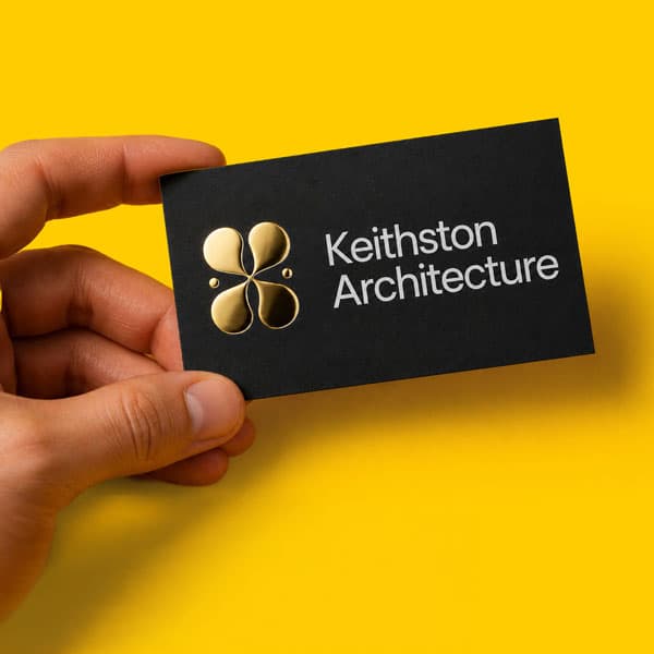
Scodix gold or silver foil A premium raised finish that catches the light and adds shine to selected parts of the design. Scodix foil can work well for logos, initials, borders or small design accents.
The finish should support the design, not overpower it. A small foil detail or spot UV highlight can feel more premium than covering too much of the card.
Different businesses need different cards. Here are a few ways to think about your design based on how the card will be used.
Trades and local services Keep the design direct and practical. Include your service area, phone number, website and a clear list of key services. A strong call to action can help, especially if you want people to request a quote.
Salons, clinics and beauty businesses Consider appointment cards or loyalty cards. A soft touch finish, foil detail or clean minimal layout can help the card feel more premium.
Cafés, restaurants and food brands Use the card as a loyalty card, mini menu prompt or packaging insert. Include opening hours, social handles or a QR code linking to menus and ordering pages.
Consultants and professional services Focus on clarity, trust and a polished finish. Keep the layout clean and make sure the contact details are easy to find.
Makers, artists and Etsy sellers Use business cards as parcel inserts, thank you cards or brand reminders. A QR code can link to your online shop, review page or social profile.
Photographers and designers Let the visual style do more of the work. Use strong imagery, a confident layout and a finish that reflects the quality of your work.
Events and exhibitions Make the card easy to scan quickly. Include your website, QR code and a clear reason to follow up after the event.
Even a good idea can be let down by small design issues. Before sending your card to print, check for these common mistakes.
Too much information If every part of the card is fighting for attention, nothing stands out. Keep the design focused.
Text that is too small Contact details need to be readable. If the font is tiny on screen, it will be even harder to read once printed.
Low contrast Make sure text stands out clearly from the background.
Important details too close to the edge Keep text, logos and QR codes away from the trim edge.
Unclear QR code Test the code before printing and make sure it scans at the intended size.
Thin borders near the edge Small trim movement can make borders look uneven.
Poor quality images Low resolution images can look soft or pixelated in print.
Forgetting the back The reverse side is useful space. Use it for a QR code, appointment details, loyalty stamps, tagline or visual brand moment.
Not proofreading Check phone numbers, web addresses, email addresses and names carefully. One small typo can make a whole batch of cards unusable.
Once your design is ready, choose the business card style that suits your brand and upload your artwork.
At WTTB, you can choose from a wide range of business card options, including classic business cards, laminated business cards, recycled business cards, kraft business cards, folded business cards, spot UV business cards, foil business cards, appointment cards and loyalty cards.
You can also use our Canva Hub if you’re creating your design in Canva, or explore the Support Guides if you need help preparing your file for print. If you want to compare stocks and finishes before ordering, a sample pack can help you choose with more confidence.
A strong business card does not need to be complicated. It needs to be clear, well made and right for the moment it will be used. Get the size, layout, paper and finish right, and your card can become one of the simplest ways to make your brand easier to remember.
The standard UK business card size is 85 x 55mm. This is a practical size because it fits neatly into wallets, pockets and card holders.
Most business cards should include your name, business name, job title or service, logo, phone number, email address and website. You can also add social media handles, a QR code, opening hours or appointment details if they are useful.
Double sided business cards usually give you more design flexibility. You can use one side for your logo or brand message and the other side for contact details. Single sided cards can still work well for very simple designs.
A QR code is useful if you want to send people to a website, booking page, portfolio, online shop, menu or social profile. Always test the QR code before printing to make sure it scans properly.
Silk and uncoated stocks are popular choices for professional business cards. Silk gives a smooth finish and strong colour, while uncoated paper creates a softer, more natural feel. Premium, recycled and kraft stocks can also help create a more distinctive result.
Matt lamination is a good everyday professional choice, while gloss can make colours look brighter. Soft touch, spot UV and foil are useful when you want a more premium finish.
Yes, you can design business cards in Canva and print them professionally with WTTB. Export your file as a PDF Print file with crop marks and bleed enabled, then check that the size, safe area, images and QR codes are ready for print.
Focus on clarity first, then add one or two memorable details. This could be a strong colour, premium paper stock, foil detail, spot UV finish, square format, folded layout or QR code. The best designs stand out without making the card harder to read.
Posted on January 26, 2022 by Ben Riches
Related topics:

£19.93
£37.89
£26.24
£29.00
£29.00