Prices
A book cover has a big job to do. It needs to introduce the content, reflect the style of the publication and make someone want to pick it up. But a strong cover isn’t only about the design on the page. The finish you choose can completely change how the book looks, feels and performs in print.
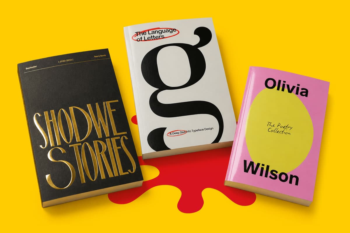
Colour, typography, imagery and layout all matter, but finishes add another layer. A gloss laminate can make colours feel brighter. A matt laminate can create a cleaner, more understated result. Soft touch can give the cover a smoother, premium feel. Scodix Spot UV and Scodix foil can draw attention to selected details, helping titles, logos, patterns and design features stand out.
Whether you’re printing a novel, photography book, brand lookbook, catalogue, portfolio, yearbook or limited edition publication, cover finishes can help turn a good design into a more complete printed product.
When someone sees a book for the first time, the cover creates the first impression. When they pick it up, the finish shapes the second. That physical experience is something digital previews can’t fully show.
A finish can make a cover feel more premium, more practical or more eye catching. It can also support the purpose of the book. A bold photographic cover may benefit from extra shine and colour depth. A luxury brochure may feel more refined with soft touch lamination and foil. A business report may need a clean matt finish that feels professional without being too decorative.
The key is to choose a finish that works with the artwork, rather than adding one for the sake of it. The best book covers feel joined up. The design, binding, paper, lamination and special finishes all work together.
Lamination is one of the most important book cover choices because it affects the whole surface of the cover. It changes the look, feel and handling of the finished book, which is why it’s often the best place to start.
A laminate is applied over the printed cover to create a specific surface finish. At WTTB, common options across many printed products include gloss, matt and soft touch finishes. Each one gives the same artwork a different character, so it’s worth thinking about the result you want before you order.
Gloss lamination adds a shiny surface that helps colours appear more vibrant. It can work well for covers with strong photography, bright artwork, bold illustration or rich colour.
For image led books, gloss can help the front cover feel sharper and more vivid. It’s a good choice when you want the design to catch the light and feel visually energetic. Think travel photography, food books, children’s publications, event brochures, prospectuses, promotional catalogues and colourful brand publications.
Gloss is not always the right fit for every design. If the cover uses subtle colours, soft textures or a very minimal layout, too much shine may work against the tone of the book. But for covers that need impact, it’s a strong option.
Matt lamination gives the cover a smoother, less reflective finish. It can make a design feel clean, modern and more controlled.
This finish works particularly well for typography led covers, premium brochures, business publications, novels, journals, lookbooks and creative portfolios. If your design uses lots of white space, muted colour or a strong editorial style, matt lamination can help keep the cover looking refined.
Matt is also useful when you want the design to feel professional without being too glossy. It lets the artwork speak for itself, which can be especially useful for covers where tone, restraint and clarity matter.
Soft touch lamination is a premium finish with a smooth, tactile feel. It gives the cover a softer surface, which can make the book feel more substantial and polished when handled.
This is a strong choice for hardback books, premium paperback books, high end portfolios, lookbooks, luxury brochures, brand books, photography projects and special editions. It works well when the physical feel of the cover is part of the experience.
Soft touch can also pair well with Scodix Spot UV or Scodix foil. The softer surface creates contrast, while the raised gloss or metallic detail adds focus and impact. Used together, these finishes can make a cover feel more tactile, layered and memorable.
Scodix Spot UV is a premium finish that applies a raised, clear gloss effect to selected parts of your design. Instead of covering the whole surface, it highlights specific areas, helping them catch the light and stand out from the rest of the cover.
It can be used on details such as:
The best Spot UV designs usually use the finish with purpose. It doesn’t need to cover a large area to be effective. Sometimes a small gloss detail on a matt or soft touch cover creates more impact than using it across too much of the artwork.
For example, a photography book might use Spot UV on the title only. A brand book might use it on the logo. A novel might use it on a subtle pattern in the background. A yearbook might use it on the date, school name or cover illustration.
The result is both visual and tactile. You see the contrast when the light hits the cover, but you can also feel the raised detail when you hold it.
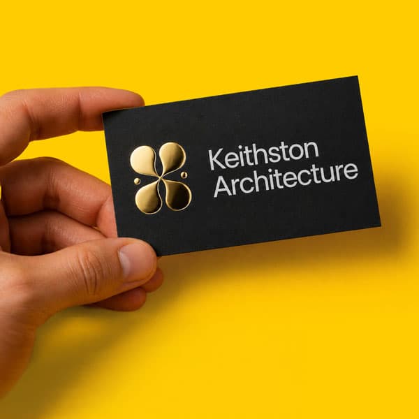
Scodix foil adds metallic detail to selected areas of the cover. At WTTB, gold and silver foil options can be used to create a premium finish that feels polished and distinctive.
Foil works well when you want to add a focal point. It’s often used on titles, author names, edition marks, logos, crests, linework, frames, icons or decorative details. It can make a book feel more special without changing the whole design.
Gold foil often feels warm, premium and traditional. It can suit luxury publications, commemorative books, wedding albums, premium catalogues and special edition covers.
Silver foil can feel cleaner, sharper and more contemporary. It can work well for photography books, technology lookbooks, corporate publications, fashion projects, design portfolios and modern editorial layouts.
As with Spot UV, restraint is important. Foil usually works best when it has space around it. Fine detail, tiny text or very complex patterns can be harder to reproduce cleanly, so bold, simple areas often give the strongest result.
The best finish combinations are the ones that support the cover design. You don’t need every available finish. You need the right finish.
A few useful combinations include:
Matt lamination with Scodix Spot UV This is a strong choice when you want contrast. The matt surface keeps the cover clean and understated, while the Spot UV adds shine to selected details.
Soft touch lamination with Scodix foil This creates a premium tactile result. The soft touch surface gives the cover a smooth feel, while the foil adds a metallic focal point.
Gloss lamination for image led covers If the cover relies on photography, colour or visual energy, gloss can help the artwork feel brighter and more immediate.
Matt lamination for clean editorial covers If the design is simple, text led or more refined, matt can help keep the cover looking controlled and professional.
Soft touch for special editions If the book needs to feel more luxurious in the hand, soft touch can help the finished product feel more polished.
Different books need different cover decisions. A finish that works beautifully for one project may not suit another, so it helps to think about the purpose of the book before choosing.
Photography books
Photography books often rely on colour, contrast and image quality. Gloss lamination can help make cover imagery feel more vivid, while matt or soft touch can create a more gallery like feel. Scodix Spot UV can be used to highlight the title without taking attention away from the image.
Lookbooks and portfolios
Lookbooks and portfolios need to feel polished and professional. Matt or soft touch lamination can help create a high quality finish, while foil or Spot UV can be used on a logo, name, title or graphic detail.
Novels and creative writing
For novels, the finish should match the tone of the cover. A literary title might suit matt lamination and subtle Spot UV. A special edition might benefit from foil. A bold genre cover may suit gloss if the artwork is dramatic or highly visual.
Catalogues and brochures
For product catalogues and brochures, the cover needs to be practical as well as attractive. Gloss can help product photography feel bright, while matt can create a more premium editorial feel. Foil or Spot UV can be used for brand marks, campaign names or seasonal collection titles.
Yearbooks and commemorative books
Yearbooks, school books and commemorative publications often need to feel lasting. Soft touch, foil and Spot UV can all help make the cover feel more special, particularly when used on dates, names, crests or edition details.
Wedding albums and keepsake books
For personal books, the cover finish should feel meaningful without overwhelming the design. Soft touch lamination, subtle foil or Spot UV can all help create a refined finish that suits keepsake projects.
Not every design needs a special finish, but some artwork styles are especially well suited to them.
Simple typography
A strong title can look impressive with foil or Spot UV, especially when it has enough space around it.
Linework and borders
Fine frames, corner details and illustrated lines can add structure to a cover. Just make sure the artwork is suitable for the finish you’re choosing.
Logos and brand marks
For corporate books, brand books, lookbooks and catalogues, a logo with foil or Spot UV can create a polished first impression.
Patterned backgrounds
A subtle pattern can work well with Spot UV, particularly over matt or soft touch lamination. It can add texture without making the cover feel too busy.
Dark cover designs
Dark covers can make foil feel especially striking. Gold or silver detail can stand out clearly against deep colours, black backgrounds or rich photography.
Minimal covers
A simple design can often carry a premium finish well. When there isn’t too much happening on the cover, the finish becomes a clearer part of the design.
The front cover usually gets the most attention, but the spine matters as well, especially for books that will sit on shelves.
The title, author name, logo or volume number should be easy to read, correctly aligned and positioned with the final spine width in mind. For bound books, spine width depends on the number of pages, paper choice and binding method, so artwork should be set up using the correct specification.
For hardback books, you also need to consider the way the cover wraps around the board. Important content should be kept away from areas where it could be lost into folds, joins or the gutter. This is one reason book artwork needs more care than a flat flyer or poster.
If the spine is part of the design, keep it simple. Strong typography, clear contrast and correct spacing will usually work better than overcrowded artwork.
Special finishes can create impressive results, but they do need the right artwork setup. Scodix Spot UV and Scodix foil need clear instructions within the supplied file, so production knows exactly where the finish should appear.
Before supplying artwork, check the relevant Support Guides for your chosen finish and book type. These can help with lamination choices, Scodix setup, foil artwork, Spot UV artwork, hardback cover setup, perfect bound artwork and print ready file preparation.
It’s also worth checking:
If you’re using Scodix, foil or Spot UV, avoid treating the finish as an afterthought. Build it into the design from the start so the printed cover feels intentional.
Book covers have more moving parts than many other print products. You’re dealing with the front cover, back cover, spine, lamination and sometimes extra finishes too. If something is positioned incorrectly, it can affect the finished result.
WTTB’s Artwork Technical Checks can help identify common artwork issues before your file moves into production. This can be especially useful if your book includes special finishes, detailed cover artwork or a spine that needs accurate setup.
A standout book cover doesn’t need to be loud. It needs to suit the content, reflect the purpose of the publication and feel right when someone picks it up.
Gloss, matt and soft touch lamination can shape the overall surface of the cover. Scodix Spot UV can add raised gloss detail. Scodix foil can create a premium metallic highlight. Used well, these finishes can help your book feel more polished, more professional and more memorable.
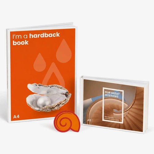
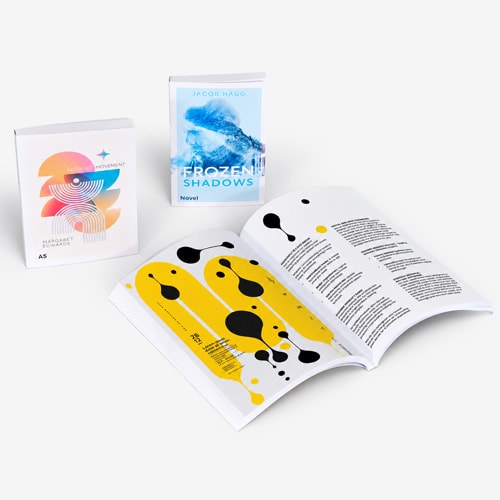
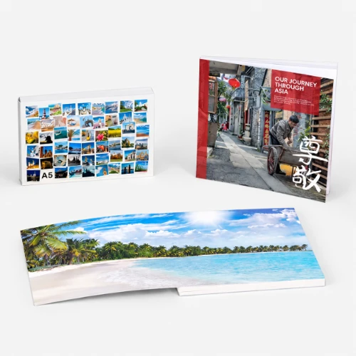
Whether you’re creating a hardback book, paperback book, photography book, brand lookbook, catalogue, yearbook, portfolio or special edition, WTTB’s Book Super Centre can help you explore book printing options, compare formats and bring your story to life.
Posted on June 10, 2026 by Ben Riches
Related topics:
£85.13
£136.00