Prices
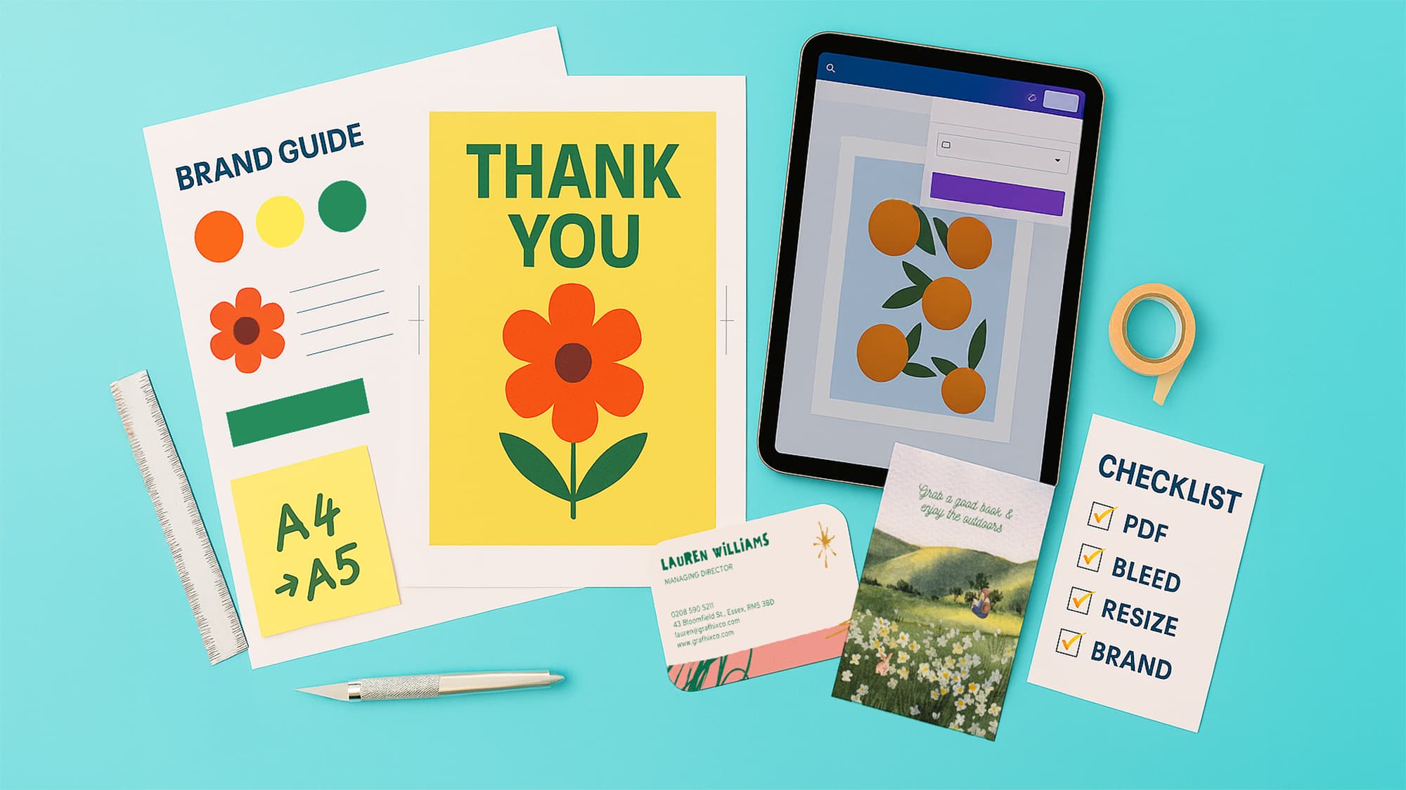
Designing in Canva is quick and intuitive. But when it comes to printing, a few common errors can turn a great design into a disappointing final product. Whether you’re creating art prints, stickers, packaging or business cards, the difference between good enough and professional often comes down to the details.
Here are the most common Canva print mistakes we see at WTTB — and how you can avoid them like a true Print Sorcerer.
The mistake: designing right to the edge of your canvas, or placing text too close to the trim line.
The fix:
Adding bleed ensures your design trims cleanly and professionally.
The mistake: exporting as PNG or a standard PDF with no crop marks or bleed.
The fix:
This one step avoids the most common file rejection issues.
The mistake: dropping in screenshots or web images that look fine on screen but print pixelated.
The fix:
High-resolution files are essential for art prints, photography and any design with fine detail.
The mistake: relying on neon tones or highly saturated blends that don’t translate to print.
The fix:
Remember: colours on your screen are lit pixels. Print is ink on paper — they’ll never look identical.
The mistake: packing too many elements into one design, leaving it cluttered and hard to read.
The fix:
A clean layout prints better, looks more premium, and is easier for customers to engage with.
Print shouldn’t be trial and error. By applying a few simple rules — add bleed, export correctly, use high-res images, choose realistic colours, and simplify your layouts — you’ll create Canva designs that print perfectly the first time.
At WTTB, we combine expert printing with built-in file checks so you don’t have to second-guess. It’s not just print. It’s Print Sorcery.
Posted on September 9, 2025 by Emma Thompson
Related topics: