Prices
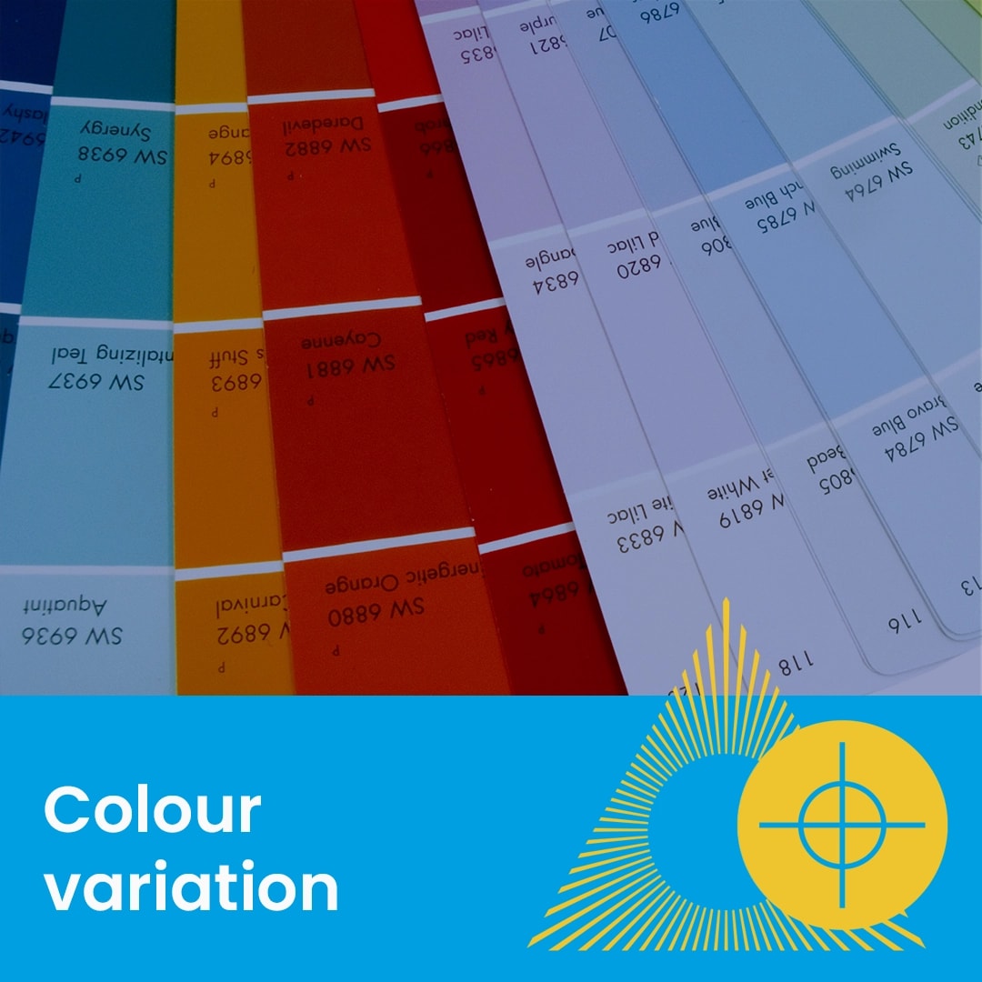
While your projects are printed to our strict ISO industry standards, natural variations in the four-colour process (CMYK) mean that slight shifts in finished colour are a standard part of professional printing.
The most common cause of colour disappointment is the difference between how light-based digital screens and ink-based paper display colour.
Light vs Ink: Digital screens use RGB (Red, Green, Blue) light, which can never be perfectly matched by physical ink on paper.
Calibration: Colours can change significantly depending on your digital screens individual settings and calibration.
Acrobat Viewing: Ensure you are not using a "web-based" preview setting in Adobe Acrobat. Use a professional viewing profile to see the most accurate representation of your final print.
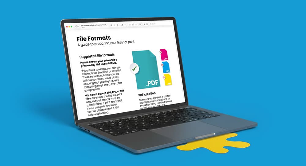
Colour Mode: All RGB, Spot Colours and Pantone colours must be converted to Process (CMYK) before you upload your file.
Banding appears as visible streaks or lines across large, solid areas of print. This is often caused by the ink density being too low for the printer to create a smooth gradient.
Avoid Single Inks: To prevent banding, avoid using large blocks of colour made from just one ink (e.g., 100% Black or 100% Cyan).
The Rich Colour Solution: For the smoothest and deepest results, use "rich" colours composed of two or more inks.
Rich Black Formula: Instead of standard black (C:0 M:0 Y:0 K:100), use our recommended formulas: Rich black for digital print: C:20 / M:20 / Y:20 / K:100 Rich black for lithographic print: C:30 / M:30 / Y:30 / K:100
In professional printing, minor variations are normal and to be expected within a close range.
Multiple Items: On orders with multiple products, you may notice very minor colour variations between different items.
Reprint Shifts: Subsequent reprints may vary slightly from previous runs due to changes in environmental factors and press calibration.
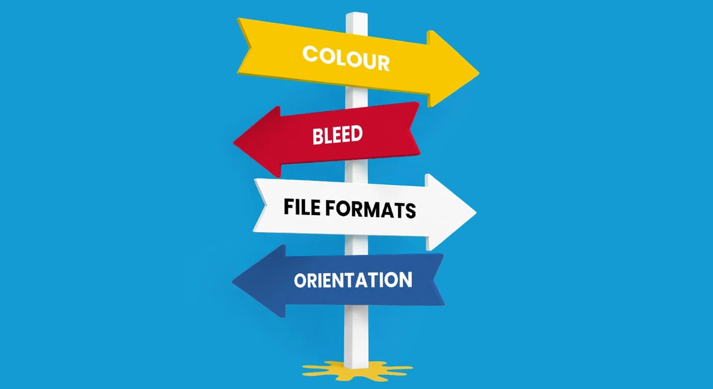
Need more help? Explore our additional support guides for expert advice on artwork setup, print file preparation, bleed and crop marks, colour setup, large format artwork and troubleshooting common print file issues.
Our support guides also cover paper stock selection, premium print finishes including spot UV and Scodix, preparing print-ready artwork and understanding the best setup for a wide range of printed products.
Before ordering, you can also use our artwork technical check tool to identify common artwork problems, including low resolution images, missing bleed, incorrect dimensions and RGB colour profiles.
You can also browse our full range of print products, including banners, business cards, flyers, posters and large format printing solutions.