Prices
Some printed books are made to be read page by page. Others are made to be opened, shared and enjoyed as a full spread.
That’s where layflat book printing comes in. Designed to open flat, layflat books help photography, artwork and visual layouts flow across the page with less interruption at the centre. For image led projects, that can make a big difference to the way the finished book looks and feels.
Whether you’re creating a wedding photo album, a photography portfolio, a brand lookbook, a property presentation or a premium keepsake, layflat binding can help your work feel more polished, more practical and more professional.
In this guide, we’ll explain how layflat books work, when to choose them, how they compare with other binding types and what to think about before you send your artwork to print.
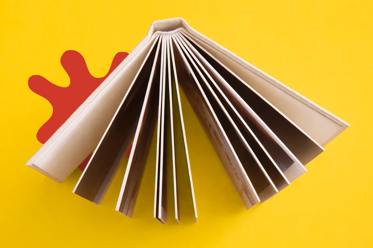
Layflat book printing is a binding method that allows a book to open flat without the pages lifting, curving or springing shut. Instead of forcing the reader to hold the book open, each spread is designed to sit open more naturally.
This makes layflat books especially useful for double page imagery. A landscape photograph, wedding portrait, product shot or full spread design can run across the centre with a much cleaner viewing experience than you’d usually get from a standard bound book.
The structure is different too. Layflat pages are built in a way that creates thicker, more substantial leaves. This gives the book a premium feel and helps each spread hold its shape when open.
That doesn’t mean every book needs layflat binding. It’s a specialist option, and it works best when the spread itself is a major part of the design.
The biggest benefit of layflat binding is the way it treats visual content. In a standard bound book, the centre fold can interrupt images, pull detail towards the spine or make the reader press the pages down to see the full design.
With layflat binding, the book opens much more cleanly. This helps panoramic images, full page photography, illustrations, layouts and design details feel more continuous.
It also improves the experience of looking through the book. A layflat photo book can sit open on a table, desk or display surface, making it easier to view, share and present. That’s useful for personal projects, but it’s also valuable for commercial print where the book needs to make an impression.
If your book is image led, highly visual or designed to be kept, layflat binding helps give it the weight and finish the content deserves.
Layflat and perfect bound books both have their place, but they’re designed for different types of projects.
Perfect bound books are a strong choice for text led publications, magazines, reports, catalogues and longer books. The pages are gathered together, glued along the spine and secured inside a wraparound cover. This creates a clean paperback finish that works well for higher page counts and more traditional reading formats.
Layflat books are different. They’re designed for impact across the spread. If your design relies on photography, wide visuals, image heavy layouts or a premium presentation feel, layflat is often the better choice.
As a simple rule, choose perfect bound when the reader is mainly moving through pages in sequence. Choose layflat when the full spread needs to be seen, appreciated and handled with ease.
For a wider comparison of book formats, explore our Book Super Centre.
WTTB offers both Hardcover Layflat Photo Books and Softcover Layflat Photo Books via our bespoke printing service, so the right option depends on the purpose of your project.
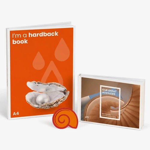
Hardcover layflat books are ideal when you want a more premium, durable and gift worthy finish. They work well for wedding albums, professional photography portfolios, commemorative books, corporate presentation books and coffee table style projects. The rigid cover gives the book a stronger presence and helps it feel more substantial from the first impression.
Softcover layflat books are lighter and more flexible. They’re still designed to open flat, but the overall feel is more portable. They can work well for lookbooks, creative portfolios, event books, travel photo books, sample books and projects that need a premium spread without the weight of a hardback cover.
Both options can help photography and visual layouts feel more polished. The difference is in how the book will be used, handled and presented.
Layflat books are most effective when the content benefits from a full, open spread. That makes them a natural choice for photography, design and presentation led projects.
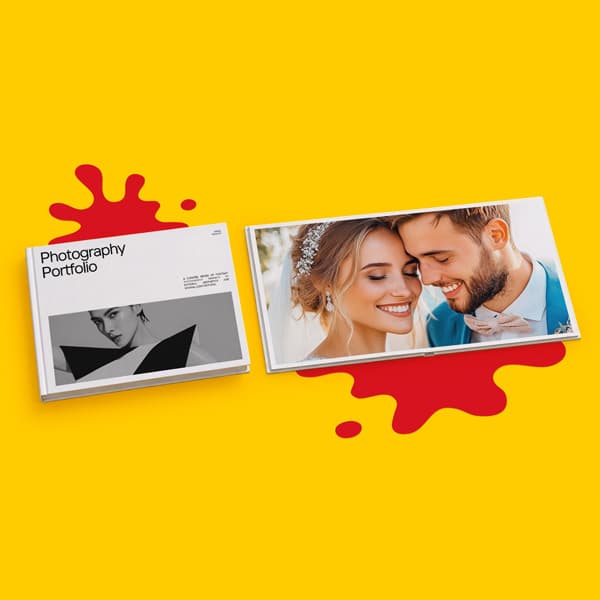
Wedding albums are one of the clearest examples. A layflat wedding photo book allows venue shots, ceremony images, group photos and landscape photography to sit across the spread without losing important detail in the centre. It gives the album a more premium feel and helps each moment feel properly displayed.
Photography portfolios also benefit from layflat binding. Whether you’re presenting portrait work, product photography, landscapes, interiors or editorial projects, a layflat format gives images more room to breathe. It’s easier to show your work confidently when the book stays open and the spread can be viewed without distraction.
Layflat books can also work well for property and interior design presentations. Wide room shots, architectural visuals, floor plans and finish details can be shown clearly across the spread, which helps the book feel more immersive.
For brands, layflat books can be used for lookbooks, campaign books, product launches and premium brochures. If the design is built around strong visuals, texture, mood and storytelling, the layflat format can make the presentation feel more considered and memorable.
They’re also a strong option for travel books, family photo books, art catalogues, yearbooks, anniversary books and keepsakes where the finished piece needs to be kept, shared and returned to over time.
Paper choice has a big impact on how a layflat book feels in the hand and how the printed images appear.
For layflat books, the pages already feel more substantial because of how the spreads are constructed. WTTB’s layflat books use ultra thick 280gsm or 340gsm pages, which gives each page a more premium feel than a standard paper sheet.
The paper finish affects the look of the design too. Silk is a strong all round choice for photo books and visual projects because it gives a smooth finish with good colour reproduction. Gloss can add more shine and visual punch, which can suit bright image led artwork. Uncoated creates a softer, more natural feel and can work well for understated photography, editorial layouts or projects that need a less reflective finish.
It’s worth thinking about how the book will be viewed. A glossy finish can make colour feel more vivid, but it may show more glare under bright light. A softer finish can feel more refined and easier to handle, especially for books that will be browsed regularly.
For a fuller breakdown of paper stocks and finishes, use WTTB’s Print Materials Hub.
A layflat book already gives your project a premium structure, but cover finishes can help the outside of the book match the quality of the content inside.
Matt lamination gives the cover a smooth, refined finish. Gloss lamination adds shine and a more vivid appearance. Soft touch lamination creates a velvet like feel that works well for portfolios, albums and luxury presentation books.
You can also use Scodix finishes to highlight selected parts of the cover. Scodix gold or silver foil can add a metallic finish to logos, titles, borders or small design details. Scodix spot UV can create a raised gloss effect that contrasts with the rest of the cover.
These finishes work best when they’re used with restraint. A simple title, small mark, date, monogram or brand detail can often feel more premium than a busy cover with too many effects competing for attention.
Layflat books need careful artwork preparation because the format depends on clean spreads, accurate page order and correct file setup.
Start by downloading the correct product template. This will help you set up the cover, page size, bleed and safe areas correctly. Make sure you delete any guide layers before exporting the final print file.
Your artwork should be supplied as a print ready PDF. Use CMYK colour settings where possible, embed or outline fonts and check that image resolution is suitable for professional print. For photography led books, image quality matters, so avoid stretching low resolution images across full pages or double page spreads.
You should also think carefully about what crosses the centre of each spread. Layflat binding is designed to reduce interruption, but it’s still good practice to avoid placing tiny text, important faces or critical design details exactly on the centre line where possible.
For layflat photo books, WTTB recommends exporting inner pages as individual pages rather than spreads. This helps ensure panoramic designs are printed and assembled in the correct order.
For extra support, use WTTB’s Support Guides or our Artwork Technical Check service before uploading your file.
One common mistake is choosing layflat binding only because it sounds premium. It is premium, but it’s most useful when the project needs that flat opening format. If your book is mainly text, a standard binding type may be more practical.
Another mistake is using images that aren’t high enough quality. Layflat books are often used for large photographs, so poor resolution can be more obvious. Check your images before you build the final file, especially if they’re going across a full page or full spread.
Artwork setup can also cause issues. Missing bleed, incorrect page order, fonts that haven’t been embedded and design details placed too close to the trim can all affect the finished result. This is especially important on books, where small setup errors can repeat across many pages.
It’s also worth thinking about finish. A high gloss look might be right for bold photography, but it might not suit every project. If the book will be handled often or viewed under strong light, a matt or soft touch finish may create a more comfortable viewing experience.
Layflat binding is a strong format, but it isn’t always the best route.
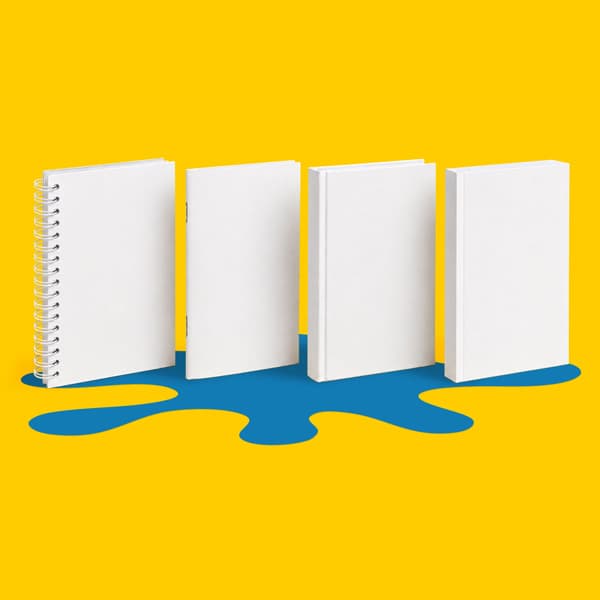
For short booklets, brochures and lower page count publications, saddle stitched books may be more suitable. For longer text led publications, reports, manuals or catalogues, perfect bound books can offer a clean and practical paperback finish. For notebooks, workbooks or training documents that need to stay open during use, wiro bound books can be a better fit.
Layflat is best when the spread matters. If your book relies on photography, artwork, product images or visual storytelling, it’s a strong choice. If the content is mainly text or the project is more budget led, another binding type may make more sense.
The easiest way to compare your options is through WTTB’s Book Super Centre, where you can explore different book formats, binding types, papers and finishes in one place.
A great layflat book turns strong photography into a finished piece that looks sharp, feels professional and makes an immediate impact. With the right paper, finish and artwork setup, every image has the space to work harder on the page.
Whether it’s a wedding album, photography portfolio, brand lookbook, visual presentation or keepsake, layflat printing gives each spread a clear, uninterrupted view, helping your photographs shine.
A layflat book is a printed book designed to open flat, allowing each spread to sit open with less interruption at the centre. It’s ideal for photography, portfolios, albums and visual projects where the full spread matters.
Yes. Layflat books are especially well suited to photo books because they allow images to be displayed across a full spread more cleanly. This makes them a strong choice for wedding albums, travel books, family photo books and professional photography portfolios.
Perfect bound books have pages glued into a wraparound cover, creating a paperback style finish. Layflat books are designed to open flat, making them better for full spread images and premium visual layouts. Perfect bound is often better for text led books, while layflat is better for image led projects.
Choose hardcover layflat books if you want a more premium, durable and gift worthy finish. Choose softcover layflat books if you want something lighter and more flexible while still keeping the benefit of a flat opening spread.
Yes. Layflat books are designed to make double page images look cleaner and more continuous. It’s still best to avoid placing tiny text, important faces or critical design details directly on the centre line where possible.
Silk is a strong all round choice for smooth colour reproduction. Gloss can work well for bold, bright photography, while uncoated gives a softer and more natural finish. The right choice depends on the look, feel and use of your book.
Use the correct product template, include bleed, embed or outline fonts, check image resolution and export your file as a print ready PDF. For layflat photo books, inner pages should be exported as individual pages rather than spreads.
Yes. Layflat books are a strong choice for photography, design, art, architecture, interiors and product portfolios because they open flat and allow visual work to be shown clearly across each spread.
Posted on June 1, 2026 by Emma Thompson
Related topics: