Prices
Colour is one of the first things people notice about a piece of print. It can make a flyer feel bold, a business card feel premium, a poster feel urgent or a book cover feel calm and refined.
But colour in print doesn’t always behave in the same way as colour on screen.
A design can look bright and punchy on your laptop, then appear softer once it’s printed. A solid background can look smooth on screen, then show slight banding across a large printed area. A colour that feels perfect on coated paper might look more muted on an uncoated stock.
That doesn’t mean anything has gone wrong. It means colour is affected by the way it’s created, viewed and produced.
If you’re designing print for your business, brand, event, shop or creative project, understanding a few colour basics can help you make better decisions before you upload your artwork.
Screens and print create colour in completely different ways.
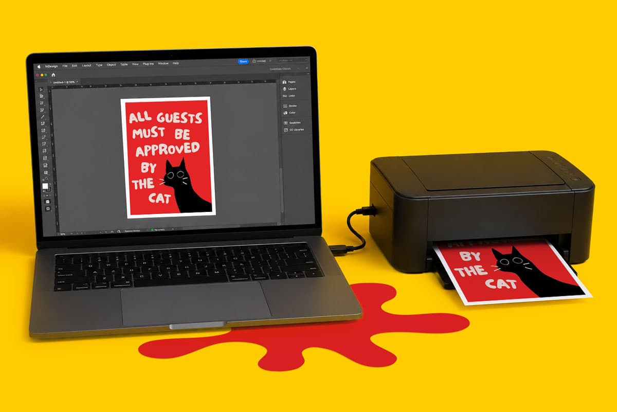
Screens use RGB colour. That means red, green and blue light are combined to create the colours you see on a phone, tablet, laptop or monitor. Because screens use light, they can often show very bright, vivid colours.
Print uses CMYK colour. That means cyan, magenta, yellow and black ink are combined to create printed colour on paper, card, vinyl, board or other materials.
This difference matters because not every RGB colour can be recreated exactly with ink. Bright blues, vibrant greens, neon shades and very intense colours can look different once they’re converted for print.
That’s why artwork that looks perfect on screen can shift slightly when printed. For the best result, it’s always worth setting up your artwork in CMYK where possible, checking your colours carefully before export and reading the Print Colour Guide before placing your order.
RGB stands for red, green and blue.
It’s mainly used for digital design, including websites, social media graphics, online adverts, video content and anything intended to be viewed on a screen.
RGB is great for digital use because it can create bright, glowing colour through light. The issue comes when RGB artwork is used for professional print. If your artwork is supplied in RGB, it needs to be converted into CMYK before it can be printed.
That conversion can cause some colours to change. A bright digital blue may print slightly flatter. A vivid green may lose some intensity. A neon style shade may not print as brightly as it appears on screen.
If you’re designing in Canva, read the Canva Checklist before exporting your file. It explains how to prepare your design for print, including bleed, crop marks, image quality and PDF Print export settings.
CMYK stands for cyan, magenta, yellow and black.
It’s the standard colour mode used in professional print. Instead of using light, CMYK uses ink to build colour on a physical surface.
For most printed products, your artwork should be prepared in CMYK. This gives a more realistic view of how your colours are likely to behave when printed.
CMYK is especially important for products such as business cards, flyers and leaflets, brochures, menus, posters and branded stationery, where colour consistency and presentation matter.
If you’re preparing artwork in professional design software, set your document to CMYK from the start. If you’re using Canva or another online design platform, check the export settings carefully and use PDF Print where available.
Even when artwork is set up correctly, small colour variations can still happen in print.
That’s because print colour is affected by several practical factors, including the paper, material, ink coverage, print process, finishing choice and viewing light.
A colour printed on silk paper won’t always look the same on uncoated paper. A colour printed on a rigid board may look different from the same colour printed on a flyer. A laminated product can also change how colour appears, especially if the finish adds shine, depth or a softer surface.
This is why colour should be treated as part of the whole print decision, not just a design choice.
If colour is central to your project, explore the Print Materials Hub before ordering. Comparing paper stocks, finishes and materials can help you understand how the final product might look and feel.
Paper has a big impact on printed colour.
Silk paper gives a smooth, polished result that works well for flyers, brochures, menus and general marketing print. It offers a good balance between sharpness and a refined finish.
Gloss paper can make colours look brighter and more vibrant because of its shiny surface. It’s useful when you want photography, promotional graphics or bold artwork to stand out.
Uncoated paper has a softer, more natural feel. Colours can appear more muted because the ink absorbs into the surface differently. This can work well for stationery, invitations, creative print and designs where texture matters.
Recycled paper can give colour a warmer or more organic appearance, depending on the stock. It’s a strong choice when the material itself is part of the look and feel of the finished piece.
Premium and textured papers can add character, but they can also change the way colour appears. If your design relies on very precise colour, it’s worth comparing materials before committing to a full print run.
Finishes can also change how colour looks.
Gloss lamination can make colour feel brighter and more reflective. It’s useful for print that needs impact, shine and strong visual contrast.
Matt lamination gives a smoother, lower shine finish. It can make colour feel more refined and less reflective, which works well for premium print, book covers, business cards and presentation materials.
Soft touch lamination adds a velvety feel and can make colours appear slightly deeper or softer. It’s often used when the tactile finish is as important as the visual design.
Special finishes such as Spot UV, Scodix and foil can also affect how colour is perceived. They don’t just add decoration. They create contrast between flat colour, shine, texture and raised detail.
For products using specialist finishes, always check the setup guidance before supplying artwork. Some finishes need separate artwork pages or specific spot colour setup, so it’s worth reviewing the relevant Support Guides before ordering.
The right colour choice depends on where the print will be used and what you need it to do.
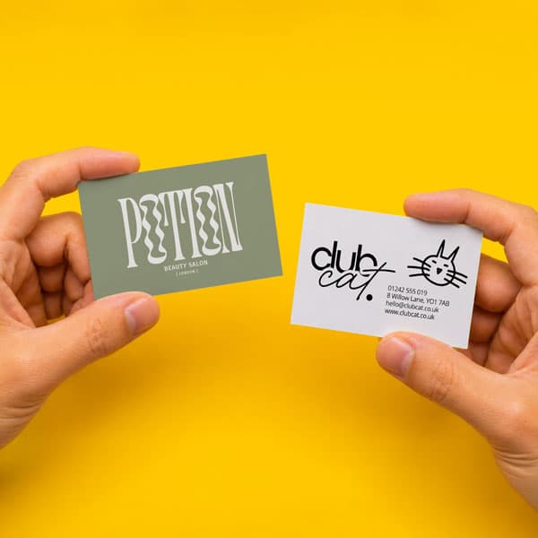
For business cards, colour needs to support recognition and readability. Strong brand colours can work well, but small text should stay clear, sharp and easy to read.
For flyers and leaflets, colour needs to guide attention. Use stronger colours for offers, calls to action and key messages, but avoid making every element compete for attention.
For posters, banners and signage, colour needs to work from a distance. High contrast between text and background is important, especially if the design needs to be read quickly.
For book covers, colour needs to match the mood of the content and the finish of the product. A dark cover with foil can feel premium and dramatic. A soft colour palette on matt or soft touch lamination can feel calm, editorial or high end.
For packaging and stickers, colour needs to work with the material and the product. If the print sits next to other items, strong contrast and clear branding can help it stand out.
A few simple checks can help you avoid the most common colour problems before your file is uploaded.
If you’re unsure about file setup, the Creating a Print Ready PDF guide is a useful place to start. It covers key checks such as resolution, fonts, colour mode, bleed, crop marks and document size.
Colour psychology can still be useful, but it shouldn’t be the only thing guiding your print decisions.
Blue is often used to suggest trust, calm or professionalism. Red can create urgency and energy. Green is often linked with nature, wellbeing and sustainability. Yellow can feel bright, friendly and attention grabbing. Purple can suggest creativity, luxury or imagination.
Those meanings can help shape a brand or campaign, but print adds another layer. You also need to think about paper, finish, readability, ink coverage and the environment where the item will be used.
A colour that works beautifully on a website might need adjusting for a printed flyer. A background that looks bold on screen might need more contrast for signage. A brand colour that feels premium on coated paper might look different on uncoated stationery.
The best colour choices work emotionally and practically.
Canva is a popular tool for creating print artwork, especially for small businesses, events, Etsy sellers and creators who want to design their own materials.
When using Canva for print, it’s important to check the file before export. Make sure the design is set to the right size, bleed is included, crop marks are enabled and images are high enough quality for print.
Colours created in Canva may still shift slightly when converted for print, so check your design carefully and avoid relying on screen brightness alone.
For a smoother setup, use WTTB’s Canva Templates where available and follow the Canva Checklist before uploading your artwork.
Colour is powerful, but in print it’s also technical.
The strongest printed results come from understanding both sides. Your colours need to suit your brand, campaign or creative idea, but they also need to work with CMYK, paper, finish, size and format.
Before you upload your artwork, take a moment to check how your colour choices will behave in print. Look at your file setup, review your paper choice, think about contrast and use the support resources available.
For more help, explore the Print Colour Guide and our Artwork Check service before placing your order.
Getting colour right isn’t just about choosing shades that look good on screen. It’s about creating print that looks clear, polished and fit for the job once it’s in your customer’s hands.
Posted on July 15, 2026 by Emma Thompson
Related topics: