Prices
Writing a children’s book starts with an idea, but turning that idea into a finished book involves much more than putting words on a page.
The age of your reader, number of illustrations, page size, binding, paper and artwork setup all affect how the finished book will look and feel. Decisions made during the writing and illustration stages can also make the book easier to produce, helping you avoid cropped artwork, misplaced text or a format that doesn’t suit the story.
Whether you’re producing a colourful picture book, an early reader, an illustrated chapter book or an activity book, this guide will take you through the process from planning your story to holding the printed copy.
Before developing characters or planning the plot, decide who the book is for.
A story for very young children will usually rely heavily on illustrations, simple language and a clear rhythm. A book for an independent reader can carry more text, longer scenes and a more developed plot. The intended age also affects how large the type should be, how much text appears on each page and how the reader will physically handle the book.
Think about whether the book will be read aloud by an adult, explored by a child independently or used as part of an activity. A picture book shared at bedtime has different requirements from a classroom workbook or a chapter book carried in a school bag.
Understanding the reader at the beginning will make later decisions about size, paper and binding much easier.
Children’s books can be imaginative, funny, educational, emotional or completely absurd. Whatever the subject, the central idea needs to be easy to understand.
Try summarising the story in one or two sentences. Who is the main character? What do they want? What prevents them from getting it? What changes by the end?
A clear central idea gives the story direction and helps you decide which scenes are essential. It can also help an illustrator understand the tone, setting and visual world you want to create.
Before writing the complete manuscript, sketch out the beginning, middle and ending. You don’t need to plan every sentence, but you should know where the story is heading and what each section needs to achieve.
A strong children’s book character doesn’t need to be perfect. They need a clear personality, a recognisable goal and a reason for the reader to care about what happens next.
Children often respond to characters who are curious, determined, mischievous or facing a problem they recognise. Even fantastical characters benefit from understandable emotions and motivations.
Keep names, appearances and personality traits consistent throughout the manuscript. This becomes especially important once illustration begins. If a character wears a red coat on one page and a blue coat on the next, the change may become distracting unless it is part of the story.
A short character reference document can help. Include descriptions of each character, their clothing, expressions, scale and any visual details that must remain consistent.
A children’s manuscript shouldn’t only be divided into paragraphs. It should be planned around pages and spreads.
A spread is the left and right page seen together when the book is open. In an illustrated book, each spread can act like a scene. It may introduce a location, reveal a character, deliver a joke or create a moment of surprise.
Page turns are particularly useful. A sentence can create anticipation on one page, with the result revealed after the reader turns over. This gives the physical book a role in the storytelling.
Once you have a first draft, divide the text into pages. Read it aloud and ask:
This rough page plan will give the illustrator and designer a much clearer starting point.
There is no single correct length for a children’s book. The right page count depends on the reader, story and binding.
Shorter picture books and activity books may work well as Saddle Stitched Books. The printed sheets are folded and stapled through the centre, creating a book that opens easily without a printed spine.
Longer stories may be better suited to Perfect Bound Books, which use a glued page block and a separate wraparound cover. This creates the square spine commonly associated with paperback books.
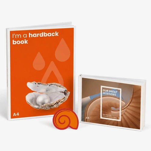
A premium picture book, keepsake or special edition may suit Hardback Books, where the pages are secured inside a rigid cover.
Page count requirements vary between binding types, so it is sensible to choose the likely format before the final illustrations are created. WTTB’s Book Super Centre lets you compare binding methods, available page counts, paper choices and finishes in one place.
Book size affects the reading experience, the appearance of the illustrations and the cost of production.
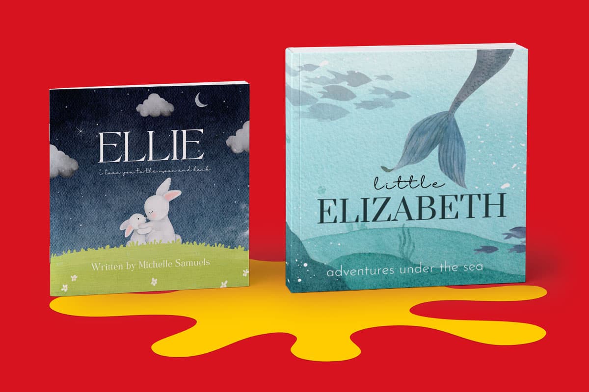
Square books are popular for illustration led stories because they provide a balanced space for characters and scenery. A format such as 210 x 210mm can give artwork plenty of room without making the book difficult to hold.
A5 portrait works well for smaller picture books, early readers and illustrated chapter books. It is compact, familiar and easy to carry.
A4 portrait provides more room for detailed artwork, educational content and activities. A landscape format can suit wide scenes, maps, groups of characters and illustrations that naturally stretch across the page.
The shape of the book should support the artwork rather than fight against it. If the story repeatedly features tall buildings, trees or full length characters, a portrait format may feel natural. Wide landscapes or large groups may benefit from a square or landscape page.
Custom sizes are also available for some book products, but standard formats can make design, production, storage and postage simpler.
The way you approach illustration will depend on how you plan to publish.
With traditional publishing, the publisher may select or approve the illustrator. Independently published authors are more likely to commission an illustrator directly, create the artwork themselves or work with a designer who can combine the text and images.
Before an illustrator starts the final artwork, agree:
Changing the format after the illustrations are complete can cause problems. Artwork created for a square page may not fit an A5 portrait page without being cropped or rearranged.
It is also important to agree ownership and usage rights in writing. In the UK, the creator of commissioned artwork will usually remain the first copyright owner unless another arrangement is agreed. Your agreement should clearly state how the illustrations can be reproduced, printed, promoted and reused.
Double page illustrations can create some of the most impressive moments in a children’s book, but they need to be designed around the binding.
The gutter is the area where the two pages meet near the spine. Some content can become harder to see in this area, particularly in glued or hardback books.
Avoid placing small text, faces, eyes or essential character details directly across the centre. A background, sky, field or less important area of an image can usually cross the gutter more safely.
The amount lost into the centre varies with the binding, page count and paper. Use the correct WTTB template and follow its safe area guidance rather than estimating the position yourself.
You should also remember that a printed spread is made from two separate pages in your artwork file. Design it as a continuous scene, but supply the pages in the format requested for your chosen book product.
The binding changes how the book opens, how many pages it can contain and how the cover is designed.
Saddle stitching works well for shorter picture books, stories, educational publications and activity books.
The pages are folded and secured through the centre with metal staples. This allows the book to open easily and keeps production relatively simple. As there is no flat spine, the title and author details need to sit on the front cover rather than along the edge.
WTTB saddle stitched books can contain from 8 to 68 pages including the cover, depending on the chosen specification.
This format can be a good choice for an author producing a short story, a trial publication or a lower page count book for schools and events.
Perfect binding is commonly used for paperback books and longer publications.
The inner pages are gathered into a block and glued along the spine. A separate cover wraps around the front, spine and back, producing a clean square edge.
WTTB perfect bound books can contain from 28 to 600 pages including the cover. The format is available in a range of standard and custom sizes, with paper and cover finish choices to suit illustrated and text led books.
Because the spine width is determined by the page count and paper thickness, the cover shouldn’t be finalised until the specification is confirmed. Download the correct template rather than calculating the spine by eye.
Keep important content at least 10mm away from the inside edge so it isn’t obscured by the glued spine.
Hardback binding can give a children’s book greater rigidity and durability.
The printed pages are secured inside a cover made using rigid board. This can suit premium picture books, gifts, keepsakes, collector editions and books that will be handled regularly.
WTTB hardback books are available from 32 to 500 pages, with options including silk, gloss, uncoated and recycled paper. Cover lamination and selected special finishes can also be added.
Hardback covers require a different artwork setup from paperback covers. The design needs to allow for the spine, cover boards, hinges and the material that wraps around the board edges. Follow the Hardback Book Cover Setup Guide before completing the design.
Wiro binding uses a metal wire along one edge, allowing pages to turn freely and remain open.
It can work particularly well for activity books, drawing books, educational resources and workbooks where the reader needs to write on the page.
The visible wire creates a different appearance from a traditional storybook, so it is best used when function is more important than creating a conventional book spine.
Paper affects colour, readability, weight, durability and the way the book feels in the reader’s hands.
Silk paper provides a smooth surface with a subtle sheen. It reproduces illustrations and photographs clearly while creating less reflection than gloss.
It is a strong general choice for books that combine colourful images with text.
Gloss paper has a shinier surface that can give illustrations stronger contrast and saturation.
It can suit vivid artwork, photography and image led pages. The reflective surface should be taken into account if the book contains large amounts of text or will be read under bright lighting.
Uncoated paper has a more natural texture with little surface reflection.
It can suit softer illustration styles, traditional storybooks and activity books. It is also more suitable for pages that need to be written or drawn on.
Colours may appear softer on uncoated paper than they do on a coated silk or gloss stock. This isn’t necessarily a disadvantage, but it should be part of the creative decision.
Recycled paper can support the environmental message of a publication while providing a more natural printed finish.
The shade and texture of recycled stock may influence colour reproduction. Review the available options in WTTB’s Print Materials Hub and consider ordering a sample before committing to the complete run.
Paper weight affects more than thickness.
A heavier paper can reduce show through from illustrations printed on the reverse and give each page more substance. However, thicker paper also increases the overall width of the book and may reduce the maximum page count available for some binding methods.
For books aimed at younger readers, a substantial paper can make pages easier to handle, but it still won’t provide the thickness of a traditional board book. Contact the Bespoke Printing team where a project requires a specialist structure that isn’t available through the standard book range.
The cover needs to introduce the story, communicate the tone and withstand regular handling.
Lamination applies a thin protective film to the printed cover. It can improve durability while changing the appearance and texture.
Gloss lamination creates a shiny surface and can make colour feel more vivid. It can suit energetic illustrations and bold graphic covers.
Matt lamination reduces reflection and provides a smoother, understated appearance.
Soft touch lamination has a velvety texture that can make a special edition or premium children’s book feel more tactile.
Selected book products can also be finished with foil or Spot UV. Foil can highlight a title, star, moon, crown or small illustrated detail with a metallic effect. Spot UV adds a gloss effect to specific areas of a matt laminated cover.
These finishes work best when they support the cover design. Applying them to a few purposeful details will usually create a clearer result than covering too much of the artwork.
For more guidance, read the Book Cover Finishes Guide.
A book cover isn’t only the front panel. Depending on the binding, it may include the front, spine and back as one continuous design.
The front cover should make the subject and tone easy to understand. The title needs to remain readable at a small size, particularly if the book will be shown as a thumbnail online.
The back cover may contain a short description, author information, publisher details, a barcode or space for a retailer label.
Perfect bound and hardback books can also have spine text where the spine is wide enough. Keep the title clear and check its direction and alignment before submitting the artwork.
Never create the final cover template before confirming the page count, paper and binding. These details determine the spine and overall cover dimensions.
A carefully written and illustrated book can still produce disappointing results if the artwork file isn’t prepared correctly.
Start by downloading the template for the exact product, size, orientation and page count you plan to order. Don’t reuse a template from a different binding type or assume two books with the same finished size will have identical cover dimensions.
Your artwork should include 3mm bleed wherever colour or imagery reaches the edge of the page. Bleed extends the design beyond the trim line, preventing unwanted white edges after the book has been cut.
Keep text, page numbers, faces and important illustration details inside the safe area. Allow additional space near the gutter where required.
Images should be high resolution at their final printed size. Artwork taken from websites or enlarged from small files can appear soft or pixelated in print.
Prepare colours using CMYK. Screens display colour using RGB light, so particularly bright colours may change when converted for print.
Before exporting the file:
WTTB’s Support Guides include specific instructions for stitched, perfect bound and hardback artwork. You can also add an Artwork Technical Check when ordering for additional checks before production.
Page order can become confusing when a book contains title pages, copyright information, blank pages or full spreads.
The first page inside the book normally appears on the right. The reverse of that page appears on the left after it is turned. This alternating pattern continues throughout the book.
Create a simple printed mock up before completing the final artwork. It doesn’t need to be high quality. Printing small page thumbnails, folding them and turning through them can reveal awkward page turns, missing blanks and illustrations that appear on the wrong side.
Supply the pages in normal reading order unless the product instructions specifically request another arrangement. The printer will handle the technical imposition needed to place them correctly on the printed sheets.
Children’s books may contain fewer words than adult books, but that doesn’t make proofreading less important.
Check spelling, punctuation, character names and repeated phrases. Look for text that has moved too close to an illustration or become difficult to read against the background.
Read the story aloud. This can reveal repeated words, unnatural rhythm and sentences that are too long for the intended reader.
The illustrations also need checking. Make sure character details remain consistent, scenes follow the correct order and no essential part of the artwork has been placed outside the safe area.
Ask another person to review both the words and the design. After working on the same pages for weeks or months, it becomes easy to see what you expect rather than what is actually there.
A screen can’t show exactly how paper, binding and colour will work together.
Ordering one copy before a larger run lets you check the physical result. Most WTTB book formats can be ordered from a single copy, making it possible to review the book before committing to a larger quantity.
When the proof arrives, look at the text size, colour, image quality, page order, gutter position, cover alignment and spine.
Handle it as the reader would. Open it fully, turn every page and check whether the weight and format feel appropriate. If the book is intended for a child, ask someone within the target age group to look through it where possible. Their reaction may reveal practical issues an adult reader would miss.
Make any changes to the original artwork, export a new PDF and check the revised file again before placing the complete order.
Children’s books can be published traditionally or independently.
Traditional publishers manage much of the editing, design, illustration, printing and distribution process. Authors normally submit work according to each publisher’s individual requirements.
Independent publishing gives the author more control over the content, design, specification and print quantity. It also means the author is responsible for editing, illustration agreements, artwork preparation, selling and distribution.
Copyright protection in the UK begins automatically when original literary or artistic work is created. However, when you commission an illustrator, the illustrator will usually remain the first copyright owner unless you agree otherwise in writing. A clear contract should explain ownership, payment, permitted uses and how both the author and illustrator will be credited.
Books distributed in the UK and Ireland are also subject to legal deposit. Publishers need to provide a copy to the British Library, with other legal deposit libraries able to request copies.
You may also need an ISBN where the book will be sold through bookshops, libraries or distribution platforms. Check the current requirements of the services you plan to use before completing the cover, as the ISBN and barcode may need to be included in the artwork.
You don’t need to begin with hundreds or thousands of books.
A single copy can be used as a proof, presentation copy or gift. A short run may be suitable for an author launch, school event, direct online sales or initial market testing.
Larger quantities usually reduce the cost per book, but only provide value if you have a realistic plan for storing and distributing them.
Think about where the books will be sold, how quickly you expect them to move and how much storage space is available. It can be better to begin with a manageable quantity, review demand and reorder than to hold more stock than you can use.
A successful children’s book brings the words, illustrations and physical format together.
The story determines the pace. The illustrations build the world. The binding, paper and page layout turn those elements into something a child can hold, explore and return to.
Planning the print specification early means the artwork can be created for the correct size, the spreads can work with the binding and the finished book can reflect the original idea.
Explore WTTB’s Book Super Centre to compare binding types, paper choices, finishes and artwork guides for your children’s book.
Posted on May 19, 2026 by Ben Riches
Related topics:
£136.00
£117.25
£85.13
£51.01