Prices
Lamination can make a big difference to the way your print looks, feels and performs. It can make colours appear richer, reduce glare, add a premium texture or give frequently handled print a little more protection.
That makes it a useful choice for business cards, menus, invitations, book covers, postcards, presentation materials, packaging and other printed items where the finish matters as much as the design.
The best laminated finish depends on what you’re printing, how it will be used and what you want people to notice first. A bold promotional flyer may need a very different finish from a premium invitation, a restaurant menu or a luxury business card.
This guide explains the main laminated finishes, how they affect your artwork and how to choose the right option before you print.
Lamination is a thin film applied over printed material. It changes the surface of the print and can help protect the printed sheet from everyday handling.
It’s often used to improve the final look and feel of print. Depending on the finish you choose, lamination can make the surface look softer, shinier, smoother or more tactile.
The most common options are matt lamination, gloss lamination and soft touch lamination. Some products may also offer gloss flood UV, which creates a high shine coating but is applied differently from traditional film lamination.
A laminated finish can help your print feel more complete. It adds an extra layer to the finished product, which can make it feel more polished in the hand.
For customer facing print, that can be important. A business card, menu, brochure cover or invitation is often handled directly, so the surface finish becomes part of the experience. People do not only see the design. They feel it too.
Lamination can help with:
It is not always essential, but it can be a smart choice when the printed item needs to feel more durable, more refined or more memorable.
Matt lamination gives print a smooth, low sheen finish. It creates a softer look than gloss and helps reduce glare, which can make text easier to read under bright light.
This makes matt a strong option for print that needs to look professional, clear and understated. It works well for designs where readability matters, such as menus, business cards, reports, presentation covers and information led print.
Matt lamination is also useful when you want the design to feel premium without looking too shiny. It gives print a cleaner and more controlled finish, especially when paired with simple layouts, neutral colours or strong typography.
The main thing to know is that matt lamination can slightly soften the appearance of colour. If your design relies on very bright colours or glossy photography, you may prefer gloss. If you want a premium tactile feel, soft touch may be a better fit.
Gloss lamination gives print a shiny, reflective finish. It can make colours look stronger and images appear sharper, which is why it works well for photo led designs, promotional print and bold marketing materials.
If you want your print to feel bright, energetic and visual, gloss is often the strongest choice. It can help posters, flyers, postcards, covers and promotional pieces stand out, especially when the design uses strong colour or high contrast imagery.
Gloss is also a good option for print that needs a clean, polished surface. It creates a more vibrant finish than matt and can give artwork a sharper appearance.
The trade off is glare. Because gloss reflects light, it may not be the best choice for items with lots of small text, or for print that will be read under strong lighting. It can also show fingerprints more easily than matt, particularly on darker designs.
Soft touch lamination gives print a smooth, velvety feel. It has a premium texture that makes the printed piece feel more tactile and refined.
This finish is often used when the customer experience matters. It works well for premium business cards, invitations, luxury stationery, packaging, book covers and print designed to feel more memorable in the hand.
Soft touch has a softer visual appearance than gloss. Like matt, it can slightly reduce the brightness of very vivid colours, but it adds a strong tactile quality that can make simple designs feel more premium.
It is a good choice for designs with strong typography, elegant branding, dark backgrounds, minimal layouts or luxury positioning. It can also pair well with special finishes such as spot UV or foil, where available, because the contrast between a soft surface and a raised glossy or metallic detail can feel more striking.
Gloss flood UV is not the same as traditional film lamination. Instead of applying a film, a liquid coating is added to the surface and cured using ultraviolet light.
The result is a smooth, high shine finish that can add depth and contrast to the print. It is useful when you want the surface to feel sleek, bright and polished.
Gloss flood UV is often a good option for designs where shine and colour impact are important. It can work well on postcards, business cards, invitations and other print where a strong front facing finish is part of the appeal.
Because it has a reflective surface, the same general rule applies as gloss lamination. It can create impact, but it may not be the best option for large blocks of small text or designs that need a softer, low glare finish.
Choose matt lamination when you want a smooth, professional and low glare finish. It is a strong everyday option for business cards, menus, book covers, presentation print and text led designs.
Choose gloss lamination when you want colour, shine and visual impact. It works well for photo led print, bold marketing pieces, postcards, flyers, covers and designs that need to catch attention quickly.
Choose soft touch lamination when you want a premium tactile feel. It is a good fit for luxury business cards, invitations, packaging, stationery, book covers and brand materials where the feel of the print matters.
Choose gloss flood UV when you want a very shiny coated finish with strong contrast and depth. It is useful for designs that need a polished, high shine result.
The right finish should support the purpose of the print. A laminated business card needs to feel good when it is handed over. A menu needs to be readable and practical. An invitation needs to set the tone for the event. A book cover needs to make the design feel finished before someone opens it.
Lamination can change how colour appears on the finished print.
Gloss can make colours feel brighter and more saturated because it reflects more light. It can work well for photography, bold graphics and high contrast designs.
Matt can make colours feel softer and more muted. This can look refined and professional, but it may not be the right choice if you want maximum brightness.
Soft touch also gives a softer appearance, but the main benefit is texture. It can make the finished piece feel more premium, even if the colours are less punchy than they would be with gloss.
For best results, choose your finish before finalising your artwork. A design made for gloss may not have the same effect when printed with matt, and a subtle design may feel more premium with soft touch than with a high shine finish.
Readability matters, especially for menus, brochures, reports, invitations, information cards and anything with smaller text.
Matt lamination is usually the safest choice when glare could be a problem. It keeps the surface smoother and softer, which can help text feel clearer under different lighting conditions.
Gloss lamination can make colours and images stand out, but the reflective surface can create glare. If the design includes lots of text, small print or QR codes, check that the layout has enough contrast and clear space.
Soft touch can also work well for readable print, especially when paired with clean typography and strong colour contrast. It gives a premium feel without the shine of gloss.
Printed items that are handled regularly can benefit from a laminated finish. Business cards, menus, invitations, postcards, loyalty cards, booklet covers and presentation materials can all feel more substantial with lamination.
That said, lamination does not make paper indestructible. It can help protect the surface from everyday handling, but it does not make print fully waterproof or resistant to all damage.
For items that will be handled often, think about the environment they will be used in. A menu in a busy hospitality setting may need a different finish from a premium invitation. A business card used at events may need to feel durable and polished. A book cover may need a finish that supports the artwork as well as the handling.
Lamination adds a plastic layer to printed material. That means it can affect recyclability, so it should be chosen for the right reason.
If recyclability is the main priority, an unlaminated option may be more suitable. If the printed item needs extra handling protection, a more premium surface or a longer lasting finish, lamination may still be the right choice.
The best approach is to match the finish to the job. Use lamination where it adds clear value to the finished piece, rather than adding it by default.
Strong laminated print starts with strong artwork. The finish can improve the final result, but it cannot fix issues such as low resolution images, weak contrast or missing bleed.
Before you order, make sure your file is supplied as a print ready PDF. Use CMYK colours where possible, add the correct bleed, keep important text inside the safe area and check that images are high enough resolution for print.
If your design uses dark colours, be aware that fingerprints and marks may be more visible on some finishes. If your design uses small text, make sure there is enough contrast between the text and background. If your design includes a QR code, leave enough clear space around it and avoid placing it too close to trims, folds or busy artwork.
For Canva users, start with the correct WTTB Canva template where available. This helps you work at the right size from the beginning and makes it easier to include the correct bleed and safe zones before export.
Laminated finishes can be used across a wide range of printed products.
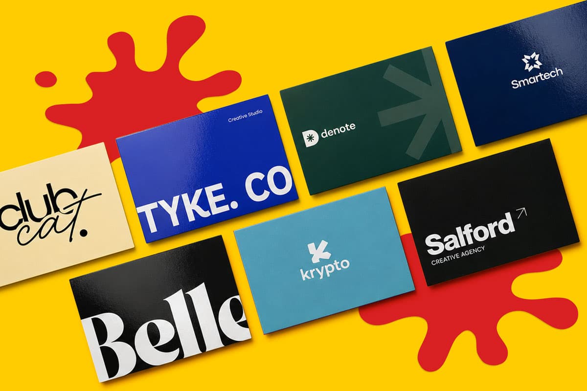
For Laminated Business Cards, matt, gloss and soft touch can all work well depending on the brand. Matt gives a professional finish, gloss makes colour stand out and soft touch adds a more premium feel.
For Custom Business Cards, lamination can shape the impression your card gives when it is handed over. It is especially useful when paired with a strong paper stock or special finish.
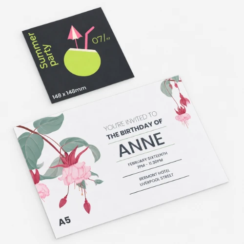
For Personalised Invitations, lamination can set the tone for the event. Matt can feel elegant, gloss can feel bright and celebratory, and soft touch can feel more luxurious.
For Flyers and Leaflets, gloss can help promotional artwork stand out, while matt may be better for information led designs with more text.
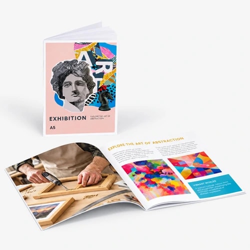
For Booklets and Brochures, laminated covers can make the finished item feel more polished while protecting the outer surface from regular handling.
For Menus, a laminated finish can help the printed piece feel more practical and finished, especially when customers will be handling it often.
Lamination covers the printed surface. Spot UV and foil are different because they are usually applied to specific areas of a design.
Spot UV can add a raised glossy detail to selected areas, such as a logo, pattern, title or graphic element. Foil can add a metallic gold or silver finish to selected details.
These finishes can work especially well when combined with matt or soft touch lamination, where the contrast between the softer background and the raised detail becomes more visible.
If you want the whole piece to feel smoother, shinier or more tactile, lamination is the finish to look at first. If you want to highlight specific parts of the artwork, spot UV or foil may be the better option.
One common mistake is choosing gloss for a design that needs lots of reading. Gloss can look bright and polished, but glare can make text harder to read in some lighting.
Another mistake is choosing matt or soft touch and expecting colours to look as vivid as gloss. These finishes can look premium, but they usually create a softer colour effect.
It is also worth avoiding lamination when it does not add anything useful. If a piece is short term, simple and mainly functional, an unlaminated finish may be enough.
Finally, do not leave the finish until the last moment. The best results happen when the artwork, paper and finish are planned together.
Lamination is more than a final coating. It changes how print looks, feels and performs in the real world.
Matt gives a smooth, low glare finish. Gloss adds shine, colour and impact. Soft touch creates a premium feel. Gloss flood UV gives a polished high shine surface.
The best finish is the one that supports the job your print needs to do. Think about how it will be handled, where it will be seen, how much text it includes and what your brand needs people to feel when they pick it up.
Explore WTTB’s Lamination Guide for more support, browse the Print Materials Hub to compare papers and finishes, or use Artwork Technical Checks before ordering to help prepare your file for print.
Posted on May 6, 2026 by Emma Thompson
Related topics:
£51.01
£19.93

£16.62