Prices
Retail has changed, but printed catalogues still have a useful role to play. They give customers time and space to explore a product range without competing tabs, notifications or adverts, while helping retailers bring products, prices and brand information together in one clear publication.
A catalogue doesn’t need to replace your website. It can guide people towards it. Printed pages can introduce a range, explain the differences between products and help customers narrow down their options. QR codes, memorable web addresses and product references can then make it easier to continue the buying journey online or in store.
Research published in JICMAIL’s Q4 2025 results found that the average catalogue was viewed for 202 seconds during the month. It generated 4.39 interactions and remained active within the home for an average of 6.9 days. The research, based on 398 catalogues, also indicated that catalogues were particularly effective at prompting purchases in shops.
Those results don’t mean every catalogue will automatically perform well. Its success will depend on the products, audience, distribution and offer, as well as how clearly the publication has been planned and produced.
A retail catalogue is a printed publication used to organise and present a collection of products. It might cover a complete range, introduce a seasonal collection, promote selected products or provide detailed information for buyers.
Catalogues are commonly used by consumer retailers, wholesalers, manufacturers, interior brands, fashion businesses, garden centres, trade suppliers and companies with complex product ranges.
A brochure usually introduces a company, service or campaign. A catalogue places greater emphasis on products, categories, specifications, prices and the steps needed to make a purchase.
The distinction isn’t always rigid, but understanding what the publication needs to do will make decisions about its format, page count and design much easier.
Before choosing paper or opening your design software, decide what the catalogue is meant to achieve.
It might introduce a new collection, bring customers back for a seasonal campaign, help sales teams explain a complex range or give visitors something useful to take away from an event. It may also support customers who prefer browsing physical print before ordering online.
Think about who’ll receive it, where they’ll read it and what you’d like them to do next. A catalogue posted to existing customers will have different requirements from one displayed beside products in a shop. A trade catalogue used during sales meetings may require more technical information than a consumer publication built around lifestyle photography.
This purpose should guide every later decision, from the size and binding to the information placed on each page.
Catalogues can quickly become difficult to manage when products are added without a clear page structure. Begin with a flat plan showing what will appear on every page or spread.
Your opening pages should introduce the range and make the catalogue easy to navigate. A contents page can help with larger catalogues, while colour coded sections, tabs or clear category headings can help readers move through the publication.
Products should be grouped logically. This might be by type, collection, price, use, room, customer or technical specification. The right structure will depend on how customers understand and compare the range.
Each product entry should follow a consistent pattern. Decide how names, descriptions, prices, product codes, dimensions, colours and ordering details will appear before laying out the complete catalogue.
Planning the page count at this stage also reduces the chance of adding unnecessary pages or having to restructure the design when the binding method is selected.
Binding affects how the catalogue looks, opens, feels and handles. For most retail catalogues, the main options will be saddle stitched or perfect bound.
Saddle stitched publications are made by folding printed sheets and securing them through the centre fold with metal staples. They’re well suited to slimmer catalogues, seasonal collections, promotional booklets and publications intended for wide distribution.
They open easily and provide a clean, familiar format without the additional thickness of a glued spine. This can make saddle stitching a practical option when postage weight, quantity or production budget matters.
WTTB’s Saddle Stitched Booklets currently support up to 68 pages, including the cover. The precise specification available will depend on the selected size, paper and finish.
Perfect bound catalogues have printed inner pages secured within a separate wraparound cover. The pages are glued along the spine, creating a flat outer edge that can carry a title, logo or range name.
This format suits larger product collections, annual catalogues and publications that need a more substantial, book like appearance. The square spine also makes the catalogue easier to identify when stored on a shelf.
Our Perfect Bound Books currently supports publications from 28 to 600 pages, including the cover, with a choice of paper stocks, laminations and specialist cover finishes.
The Book Super Centre compares binding methods, page ranges, materials and production options in one place.
The right format should give products enough room while remaining practical to distribute, store and handle.
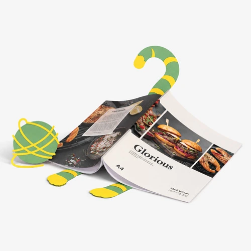
A4 provides generous space for large images, product comparisons, technical information and detailed layouts. It can work particularly well for interiors, furniture, construction products, machinery and ranges where specifications are important.
The larger pages create visual impact, but the finished catalogue may be heavier and require more space to display or post.
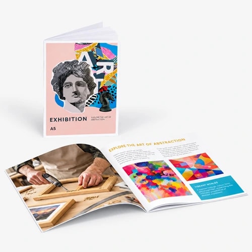
A5 is compact, easy to hold and convenient to hand out. It can be a strong choice for seasonal collections, gift ranges, fashion, beauty, food, smaller products and event distribution.
The reduced page area means information must be edited carefully. Trying to fit an A4 style layout onto an A5 page can leave the design cramped and difficult to read.
Square catalogues can create a distinctive presentation for visual product ranges, lookbooks and premium collections. Custom dimensions may also support a particular brand or packaging format.
Unusual sizes should have a practical reason behind them. Consider how the publication will be packed, posted, displayed and stored before departing from standard formats.
Paper influences colour, image reproduction, readability, weight and the way a catalogue feels in the hand. The best option depends on the balance between photography, text, cost and distribution.
Silk paper provides a smooth surface with a subtle sheen. It works well for catalogues that combine product photography, colour and written information, making it a versatile choice for many retail ranges.
Gloss paper has a shinier surface that can strengthen colour and contrast. It can suit image led catalogues where vibrant products and photography are the main focus.
Reflective surfaces may create more glare under strong lighting, so gloss isn’t always the best choice for pages containing large amounts of small text.
Uncoated paper has a more natural texture and softer appearance. It can complement independent brands, food businesses, lifestyle products, craft ranges and designs where tactility is important.
Ink behaves differently on an uncoated surface, so colours and images can appear softer than they would on silk or gloss paper. This can be part of the intended result rather than a drawback.
Recycled stocks can support a catalogue’s visual identity while providing another material choice for businesses reviewing how their print is produced.
The exact colour, texture and print response will vary between papers, so it’s worth assessing samples rather than choosing from a description alone.
WTTB’s Print Materials Hub explains the characteristics of popular paper stocks and provides access to print sample options for comparing materials before ordering.
The cover needs to identify the catalogue, communicate what’s inside and give someone a reason to open it.
A strong catalogue cover doesn’t have to include every product, message or offer. One clear image, a recognisable title and a focused campaign message will often have greater impact than a crowded collection of information.
The back cover can carry practical information such as contact details, shop locations, ordering instructions, a QR code or a final call to action.
Choosing a heavier cover stock can give the catalogue more structure and help protect the inner pages. Lamination adds another surface layer and can change both its appearance and handling.
Gloss lamination creates a bright, reflective finish. Matt lamination reduces shine for a smoother appearance, while soft touch lamination adds a more tactile surface. Foil and spot UV can be used to highlight selected cover elements where a more distinctive finish is needed.
Our saddle stitched and perfect bound formats support silk, gloss, uncoated and recycled papers, with matt, gloss and soft touch lamination available across relevant specifications. Cover options can also include foil and spot UV.
A catalogue needs to help customers find products rather than simply place them on a page.
Use consistent grids so readers learn where to find product names, prices, descriptions and reference codes. Keep headings, page numbers and category markers in the same positions throughout the publication.
Visual hierarchy is especially important when several products appear together. The most important information should be identifiable quickly, without forcing the customer to read every line.
Lifestyle photography can show products in context, while clear product images make variations and details easier to compare. The balance will depend on whether the catalogue is primarily selling an aspiration, explaining a product or helping someone select between options.
White space gives products room and helps separate categories. Filling every available area can make even a premium range feel cluttered.
Text should remain readable at the finished print size. View the artwork at its actual dimensions and print sample pages on an office printer before approving the full layout.
Customers should be able to move between products without relearning the layout.
Decide which information is essential across the full range. This might include:
Not every product needs the same amount of copy, but the structure should feel consistent. Long descriptions beside one product and unexplained codes beside another can make comparisons unnecessarily difficult.
For large ranges, create a central product data sheet before the catalogue is designed. This gives the design team one approved source for names, prices, codes and specifications, reducing the risk of inconsistent information appearing across different pages.
Printed catalogues and ecommerce can support each other.
QR codes can direct readers to individual product pages, collections, video demonstrations, booking forms or stock information. Short web addresses can offer an alternative for customers who don’t want to scan a code.
Avoid sending every QR code to the homepage. The destination should match the product or message beside it and reduce the number of steps needed to act.
Every code should be tested from the printed proof or an accurately sized test page. Check that it works on different phones, leads to the correct secure page and has enough contrast and clear space around it.
Product codes should also match those used online. A customer who types a printed reference into the website search should be able to find the correct item immediately.
Accurate artwork preparation protects the design from avoidable problems during production.
WTTB requires print artwork to be supplied as a PDF, with images at 300dpi or higher. Files should use CMYK colour, include 3mm bleed and show crop marks. The artwork dimensions and orientation must also match the ordered product. Full requirements are covered in the Creating a Print Ready PDF guide.
Bleed extends images and background colours beyond the finished page edge so minor movement during trimming doesn’t create an unwanted white line. Important text, prices, codes and logos should remain inside the safe area rather than sitting close to the trim.
Perfect bound catalogues need additional care around the spine. We recommend keeping important content at least 10mm from the inside edge so it isn’t obscured by the binding. The relevant product template should be used to calculate and prepare the wraparound cover correctly.
Download the correct template for the exact size, orientation, paper and page count being ordered. Don’t reuse an old template unless the final specification is identical.
A catalogue can be beautifully designed and technically correct while still containing an incorrect price, outdated product or broken link.
Proofreading should cover more than spelling. Check product names, codes, dimensions, prices, offer dates, page references, contact information and ordering instructions.
Test every QR code and web address. Confirm that page numbers match the contents section and check that any references such as “see page 24” still point to the right place after the layout has changed.
Look for products that have been discontinued, renamed or moved into another collection. Any legal statements, delivery conditions and pricing terms should also be approved by the appropriate person within the business.
Technical artwork checks can identify issues with file setup, but they can’t confirm that commercial information is correct. Final content approval should always happen before the artwork is uploaded.
Distribution should be decided early because it affects size, paper, page count and quantity.
Catalogues can be included with orders, displayed in shops, mailed to selected customers, used during sales meetings or handed out at exhibitions. Each route has different cost and handling requirements.
A lighter saddle stitched catalogue may make sense for large mailing quantities. A more substantial perfect bound format may be better for showrooms, key customers or sales presentations where the catalogue will be retained and referred to repeatedly.
You don’t necessarily need to send the same publication to everyone. A complete catalogue could support trade buyers and sales teams, while a shorter seasonal edition introduces selected products to a wider audience.
Catalogue results become easier to assess when measurement is planned into the design.
A unique promotional code can show which purchases followed the catalogue. Trackable QR codes and dedicated web addresses can record visits, while individual codes for different customer groups can help compare distribution methods.
Retail teams can also record when customers bring a catalogue into a shop or mention it during an enquiry. Comparing sales for featured products before, during and after distribution may reveal which ranges attracted attention.
Measurement doesn’t need to capture every interaction perfectly. It needs to provide enough evidence to improve the next edition, including which products were selected, which calls to action worked and which distribution routes produced the strongest response.
A successful catalogue brings together clear structure, accurate product information, useful design and a print specification that suits its purpose.
Binding, paper, page count and finishes should support how the publication will be used rather than adding complexity without a clear benefit. When those decisions are made early, the catalogue becomes easier to design, proof, print and distribute.
Explore WTTB’s Book Super Centre to compare catalogue printing formats, paper options, cover finishes and artwork guidance in one place. Whether you’re producing a compact seasonal booklet or an extensive perfect bound product catalogue, the right format can give customers a clear, useful way to explore your range.
Posted on April 30, 2026 by Emma Thompson
Related topics:
£117.25
£51.01