Prices
An art book does more than collect images between two covers. It gives a body of work structure, creates a physical experience for the reader and presents each piece in a format that can be shared, displayed, sold or preserved.
Artists, illustrators, photographers, galleries and creative studios can use art book printing to turn individual pieces into a coherent publication. That might be an artist portfolio, an exhibition catalogue, a limited edition collection, a visual essay or a book created for retail.
The decisions made before printing will influence how faithfully the artwork is reproduced, how easily the book opens and how the finished publication feels in the reader’s hands.
This guide explains how to choose your format, binding, paper and finishes, prepare your artwork correctly and create an art book that supports the work inside it.
For an overview of WTTB’s complete book range, production options and artwork resources, visit our Book Super Centre.
An art book is a printed publication in which visual work forms the main focus. It may document an artist’s practice, explore a particular theme or present a collection of related images.
Common types of art book include:
The term art book is sometimes used interchangeably with artist’s book, but they can describe different things. An art book usually presents or discusses creative work. An artist’s book is often conceived as an artwork in its own right, with the book’s materials, structure and method of interaction forming part of the artistic idea.
This distinction can affect production. A conventional art book may fit an established hardback, perfect bound or layflat format. An artist’s book may need unusual dimensions, materials, folds or binding methods that call for a more tailored approach through bespoke printing.
Before comparing papers or binding styles, define the purpose of the book.
A portfolio sent to potential clients needs to be clear, durable and easy to handle. An exhibition catalogue may need room for artwork, curatorial text and captions. A limited edition publication might place more emphasis on materials, finishes and collectability.
Consider the following questions:
These decisions will help you choose a format that suits both the artwork and the practical needs of the project.
There is considerable overlap between these formats, but each usually has a slightly different purpose.
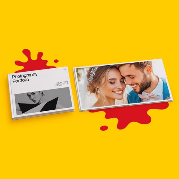
A photo book is led by photography and often uses sequencing to tell a story or document a subject. An art book may combine painting, illustration, photography, sculpture, typography and written commentary. A portfolio book is usually more selective, presenting the strongest examples of someone’s work to potential clients, galleries or employers.
You don’t need to force your project into one category. The important thing is to understand how the book will be used.
For guidance focused specifically on photography, image selection and photographic presentation, read our guide to printing a photo book.
Binding affects how the book opens, how much of each page remains visible and the impression the publication creates.
The best binding method depends on your page count, budget, artwork and intended use.
A hardback book provides a strong, durable format for artist monographs, premium portfolios, exhibition books and limited editions.
Its rigid cover gives the publication a more substantial presence and protects the pages during repeated handling. Hardback books can also accommodate higher page counts, making them suitable for larger bodies of work and publications that include essays, interviews or supporting material.
Cover laminations and selected finishes can add another layer to the presentation, but the cover design should still support the artwork rather than distract from it.
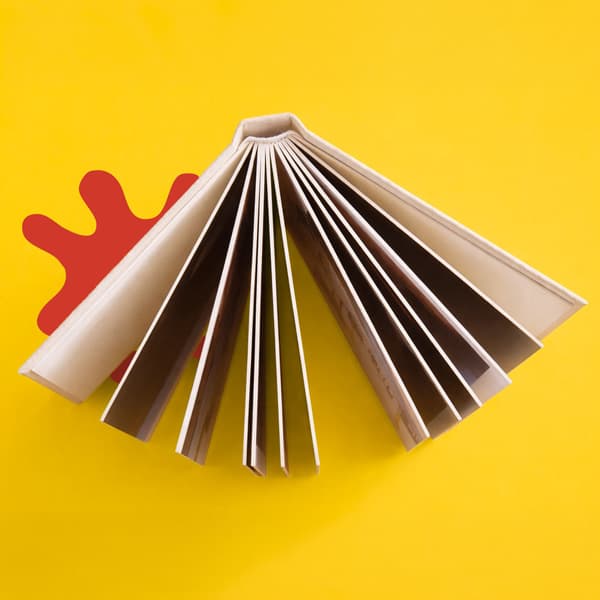
A hardcover layflat book or softcover layflat book is particularly useful when images need to extend across two facing pages.
Layflat binding allows the book to open much flatter than conventional binding, reducing the amount of an image that disappears into the centre. There will still be a join between the pages, so important details shouldn’t be placed directly across the centre line without careful planning.
Hardcover layflat books work well for premium portfolios, photography, detailed illustration and display led publications. Softcover layflat books offer a lighter and more portable alternative.
Read our complete layflat book printing guide for a closer look at how the binding works and when to use it.
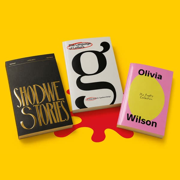
Perfect bound books have a clean, square spine and a flexible wraparound cover. They work particularly well for exhibition catalogues, design collections, illustration books and art publications intended for retail.
Perfect binding can accommodate substantial page counts while keeping the book relatively lightweight. The printable spine also gives you room for the artist’s name, publication title or gallery branding.
Unlike layflat books, perfect bound pages curve towards the spine. Important artwork, captions and text should therefore be kept away from the gutter.
Saddle stitched booklets are folded and secured through the centre. They’re a practical choice for shorter publications such as exhibition guides, small collections, zines and affordable promotional editions.
They open easily and can provide good visibility across a spread, although the total page count is more limited than perfect bound or hardback formats.
Saddle stitched books also require a page count that works in multiples of four, so the content and layout should be planned around the finished specification.
Some creative projects can’t be contained within a standard format.
You may want an unusual size, specialist paper, printed endpapers, exposed binding, a custom slipcase or a more experimental construction. In these cases, our bespoke printing service can help explore specifications beyond the standard online range.
For a broader comparison of available methods, visit our Book Binding Guide.
Paper changes how colour, contrast and fine detail appear. It also affects the book’s weight, flexibility, texture and overall character.
There isn’t one paper that will suit every art book. The right choice depends on the original work and the experience you want to create.
Silk paper has a smooth coated surface with a subtle satin appearance. It offers a balance between strong colour reproduction and comfortable readability, without the higher shine associated with gloss.
It can work particularly well for mixed art books containing images, captions and longer sections of text. Its smooth surface also helps retain detail in illustration, photography and graphic work.
Gloss paper has a coated, reflective surface that can increase the visual intensity of colour and contrast.
It may suit highly saturated photography, digital artwork and bold graphic pieces. However, reflected light can make text or darker images harder to view from certain angles, so it may not be right for every page or reading environment.
Uncoated paper has a more natural and tactile surface. Colour can appear softer and less reflective than it does on a coated stock.
This can complement drawing, printmaking, editorial illustration, muted photography and artwork where texture is part of the desired character. It also provides a comfortable surface for text heavy sections.
The softer reproduction isn’t a weakness. For the right project, it can make the printed book feel closer to a sketchbook, archive or original work on paper.
Recycled stocks can support a natural, editorial or environmentally focused direction. As with other uncoated materials, colour and fine detail may reproduce differently from the way they appear on a smooth coated stock.
Review the paper’s colour, texture and print characteristics before using it for work that depends on very precise whites, subtle gradients or delicate tonal changes.
A heavier paper can make an art book feel more substantial, but thicker isn’t automatically better.
Increasing the paper weight can affect how easily the pages turn, how the book opens and how thick the finished spine becomes. A high page count combined with very heavy paper may create a book that feels bulky or difficult to handle.
The paper should work with the page count and binding method as one complete specification.
Explore the Print Materials Hub and Paper Types Guide to compare stocks and understand how their surfaces differ.
The dimensions of the book influence how the artwork is viewed and how much space is available around each piece.
Portrait formats suit vertical artwork, editorial layouts and publications that need to sit comfortably on a shelf. Landscape formats can support panoramic photography, wide illustrations and work that benefits from horizontal sequencing. Square books create a balanced format for mixed image orientations and grid based layouts.
Larger formats provide more room for detail but can increase the cost of printing, storage and postage. Smaller books can feel more personal and encourage closer interaction, but artwork may need to be reduced considerably.
Rather than choosing a size because it feels impressive, test your largest and most detailed images at the proposed dimensions. Make sure captions remain readable and the artwork isn’t being enlarged beyond the quality of the original file.
Custom sizes are available for selected products, while unusual formats can be discussed through our bespoke service.
Art books can contain hundreds of images across covers, pages and spreads. A clear file preparation process will reduce the risk of unexpected changes during production.
Use original scans, photographs or exported artwork wherever possible.
Images taken from websites, messaging applications or social media may have been compressed. They can look acceptable on a screen but appear soft or pixelated when printed at a larger size.
Check every image at its final dimensions rather than relying only on the file’s overall pixel count.
For detailed print viewed at close range, we recommend images between 300 and 450 dpi. Increasing the resolution of a small image doesn’t create missing detail, so begin with the strongest source file available.
Screens create colour using light, usually through RGB. Commercial printing generally reproduces colour using CMYK inks.
RGB artwork can contain bright colours that can’t be reproduced in exactly the same way using CMYK. Converting your files before export gives you an opportunity to review how colours may change instead of leaving the conversion until the file enters production.
Pay particular attention to bright blues, greens, oranges, deep shadows and subtle neutral tones. Some movement between the screen and printed page is normal because paper, ink, screen brightness and viewing conditions all affect appearance.
Read our colour variation guide before preparing work where colour relationships are especially important.
Bleed is the artwork that extends beyond the final trimmed edge.
Any image, background or block of colour intended to reach the edge of the page should continue into the bleed area. This prevents fine white lines from appearing if the cut moves slightly during finishing.
Use the template and bleed measurement supplied for your chosen product rather than assuming every book uses the same setup.
Keep page numbers, captions, signatures and important image details away from the trimmed edges.
You should also allow additional space near the binding edge. This is particularly important for perfect bound and hardback books, where part of the page curves into the gutter.
We recommend keeping text at least 10mm from the inner edge. The correct safe area may vary by product, so always check the relevant template and artwork guide.
A dramatic image across two pages can create impact, but the binding will influence how much of it remains visible.
Layflat books reduce disruption across a spread, but there will still be a centre join. Perfect bound and hardback books pull more of the page into the gutter.
Avoid positioning faces, small lettering, eyes or other essential details directly on the centre line. Moving the image slightly can protect its meaning without losing the effect of a full spread.
Unless the product guide requests otherwise, book inner pages are generally supplied as individual pages in reading order rather than as designed spreads.
The printer’s production process arranges those pages for printing and binding. Supplying imposed printer spreads without being asked can result in incorrect page order.
Perfect bound and hardback covers may need to be supplied separately from the inner pages, with the back cover, spine and front cover combined into one correctly sized cover file.
Use the calculated spine width from the product specification. Don’t estimate it before choosing the final paper and page count, as both affect the finished thickness.
Before exporting, check:
We require print ready PDF files for book covers and inner pages. Our Support Guides provide product specific instructions covering common setup requirements.
You can also use our Artwork Technical Checks to identify issues involving resolution, bleed, dimensions, colour mode and book artwork setup before production.
A strong art book layout gives the work room to breathe while creating a reason to continue turning the pages.
The design shouldn’t treat every image in the same way. Some pieces may need a complete page. Others may work in pairs, groups or sequences. A change in scale can create rhythm and make important work feel more significant.
Gather the final artwork before designing the book. Record the title, date, medium, dimensions, photographer credit and any caption information for each piece.
This reduces the risk of missing details or using inconsistent information later.
Think about how one image leads into the next.
You might organise work chronologically, by collection, colour, subject, medium or exhibition space. Alternatively, the sequence might create contrasts between different images.
Print small thumbnails of each page or use a digital overview to assess the complete flow. Looking only at one spread at a time can make it harder to see repetition or sudden changes in pace.
White space separates individual works and gives the eye somewhere to rest. It can also create consistency when the original artwork includes several different dimensions or orientations.
Not every page needs to be filled. A smaller image surrounded by space can sometimes command more attention than one enlarged to the edge.
Choose one position and style for artwork titles, dimensions, dates and supporting notes.
Captions should remain readable without competing with the work. Keep them away from the trim and gutter, and check that the chosen type size still works when printed.
A spread viewed on a laptop may feel very different once printed and bound.
Print key pages at their intended dimensions where possible. This can help identify images that are too large, captions that are too small or margins that feel inconsistent.
The cover introduces the publication before the reader sees any of the work inside it.
It may feature a complete artwork, a cropped detail, typography, a restrained colour field or a completely separate design system. Whichever approach you choose, the cover should reflect the character of the publication.
Consider how the front, spine and back work together as one continuous design. This is particularly important for perfect bound and hardback books with printable spines.
Lamination can protect the cover and alter its appearance. Matt lamination creates a smooth, understated finish. Gloss increases shine and contrast. Soft touch offers a softer tactile surface.
Foil and Spot UV can highlight titles, shapes or small design elements, but they’re most effective when used with purpose. Adding every available finish won’t necessarily make the book feel more premium.
The cover should create interest while allowing the artwork itself to remain the focus.
The right quantity depends on what you intend to do with the publication.
A single copy can be used as a portfolio, submission piece, presentation sample or personal archive. A short edition may be suitable for an exhibition, launch, degree show or direct sale to an existing audience. Larger quantities can reduce the unit cost when a title will be stocked by galleries, shops or distributors.
Before choosing a quantity, account for:
We support single copy short runs and higher volume book production across its wider range, allowing a project to begin with a smaller quantity and scale when needed.
For an unusual edition, specialist materials or a more complex construction, speak to our bespoke team before completing the artwork. Production advice early in the process can prevent you from designing a format that isn’t practical to manufacture.
Before uploading your files, confirm that:
Silk paper is a versatile choice for art books because it balances colour reproduction, detail and readability. Gloss may suit vivid and highly saturated images, while uncoated paper can create a softer, more tactile character.
The best option depends on the artwork, binding and intended experience. Comparing samples is the most reliable way to judge how different stocks will affect the finished publication.
Hardback books offer greater durability and a more substantial presentation, making them well suited to premium portfolios, monographs and limited editions.
Perfect bound paperbacks can provide a professional square spine at a more accessible cost and weight. They’re particularly useful for exhibition catalogues, retail publications and larger print quantities.
Yes. Layflat binding is a strong option for art books containing panoramic images, detailed illustration or artwork that extends across facing pages.
The pages open much flatter than conventional binding, although you should still allow for the centre join when positioning important details.
For detailed artwork viewed at close range, prepare images between 300 and 450 dpi at their final printed dimensions.
A file can have a high resolution value but still lack detail if it has been enlarged from a small or compressed original. Always check the effective resolution after the image has been placed and scaled in the layout.
We support single copy short runs across much of its book range, although minimum quantities depend on the particular product and specification.
A single copy can be useful for checking a portfolio, preparing a submission or reviewing a publication before ordering a larger edition.
Artwork can run across facing pages, but the binding method will affect the result.
Layflat binding provides the clearest view across a spread. Perfect bound and hardback books have a deeper gutter, which can hide part of the image. Keep faces, text and essential details away from the centre.
Book inner pages should normally be supplied as one multipage PDF containing individual pages in reading order.
Covers for perfect bound and hardback books may need to be supplied as a separate file containing the back cover, spine and front cover. Always follow the artwork guide for the chosen product.
A photo book is primarily built around photography. An art book can include illustration, painting, photography, sculpture, typography, essays and other creative work.
The production methods can be similar, but an art book may need to accommodate a wider range of image styles, captions and supporting text.
The strongest art books bring artwork, layout, paper and binding together as one complete experience.
Whether you’re producing a single portfolio, an exhibition catalogue, a limited edition artist publication or a larger retail run, we offer professional book printing supported by practical artwork guides and technical expertise.
Explore binding styles, formats, papers and production support inour Book Super Centre, or contact our bespoke printing team to discuss a more unusual publication.
Posted on May 22, 2026 by Emma Thompson
Related topics:
£136.00